
LOCAL CLTV
Local artists.
A shared identity.

Local sound. Local people.
LOCAL CLTV brings local electronic artists and audiences together through its own events, from techno to its subgenres. I designed the brand identity and everything around the nights: posters, artist announcements, signage and printed materials.
A local point of connection.
The “O” points to local.
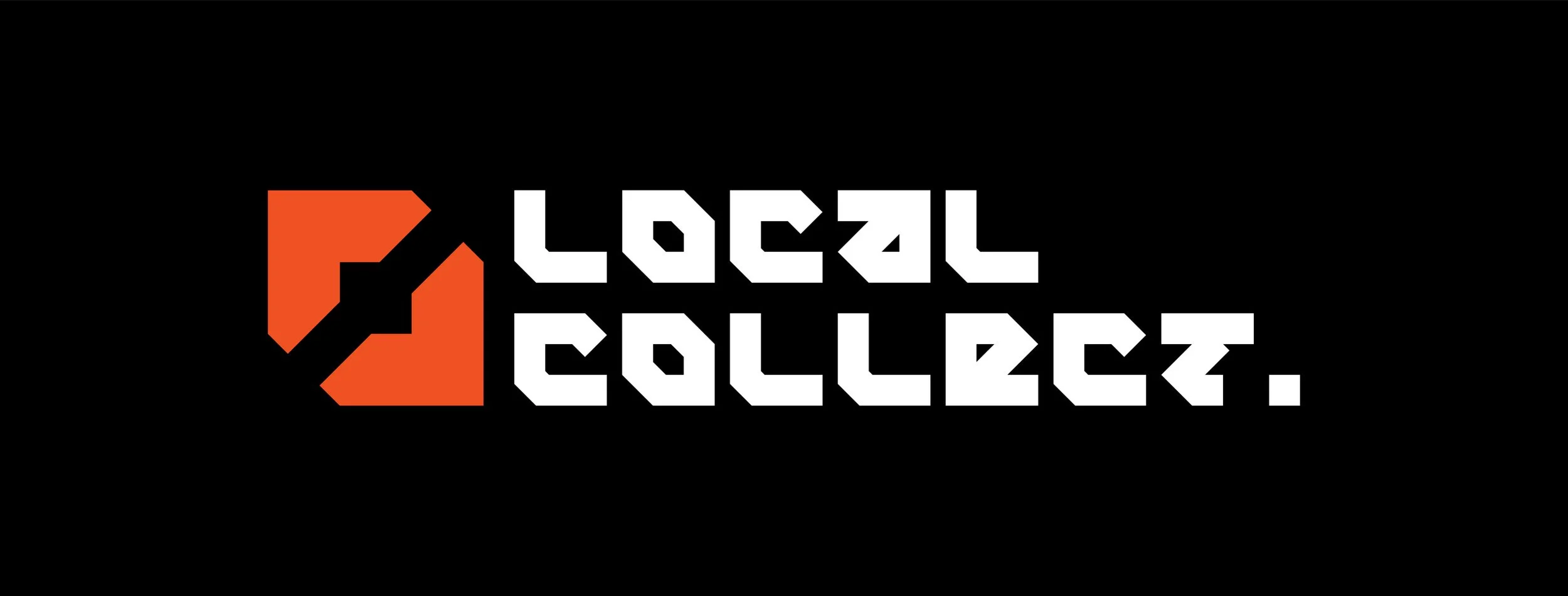
I shaped the “O” like an arrow and a location marker. It represents the local artists and people the collective brings together.
Heavy, angular lettering gives the identity the bold, industrial feel I wanted. Orange on black sets the starting point.
See the wider logo lockup
LOCAL No.1
Orange. Raw. Direct.
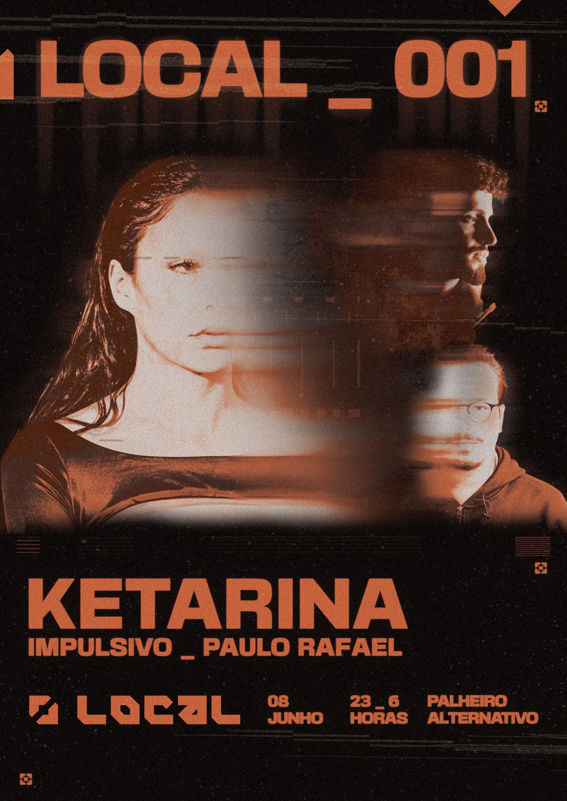
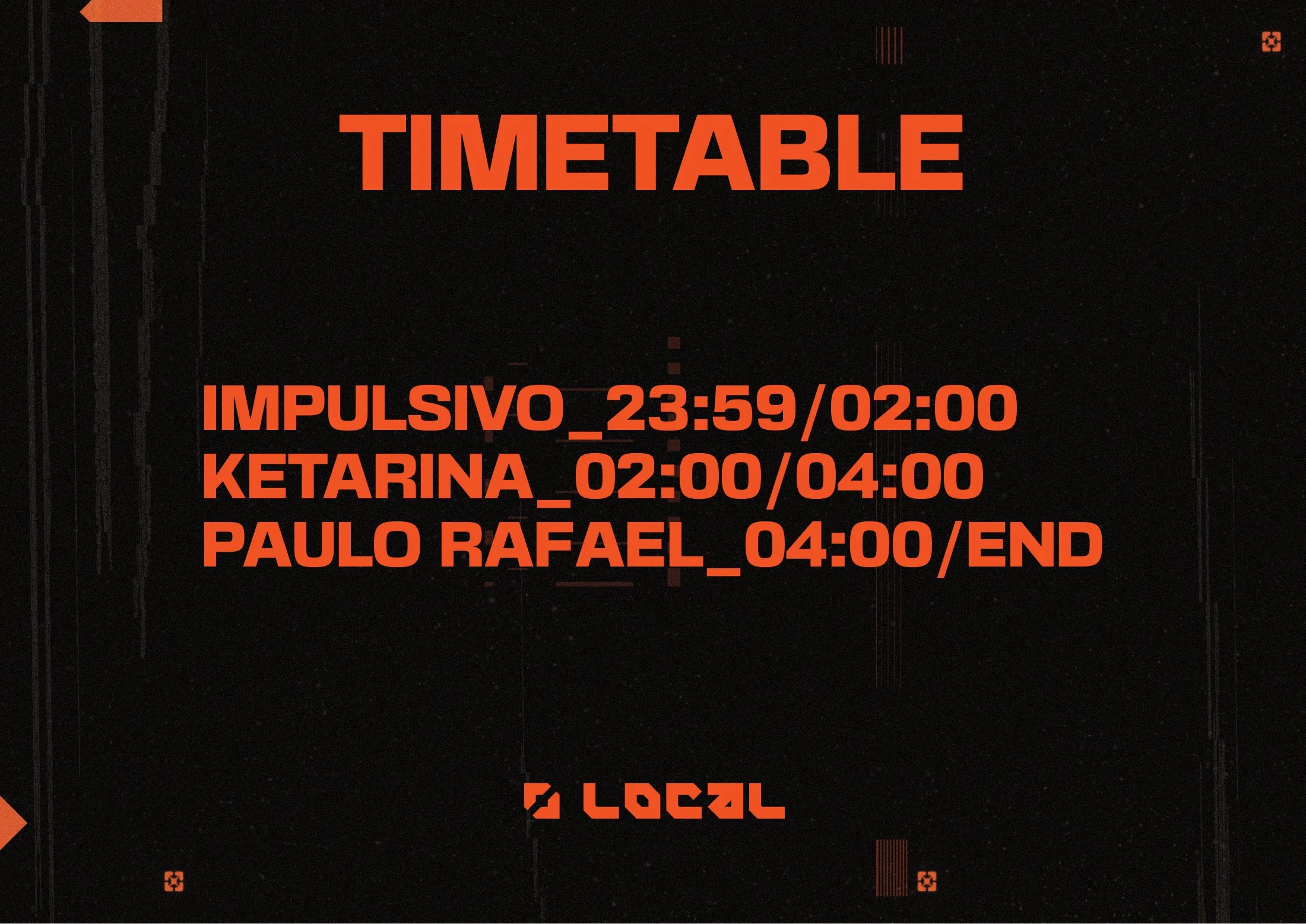
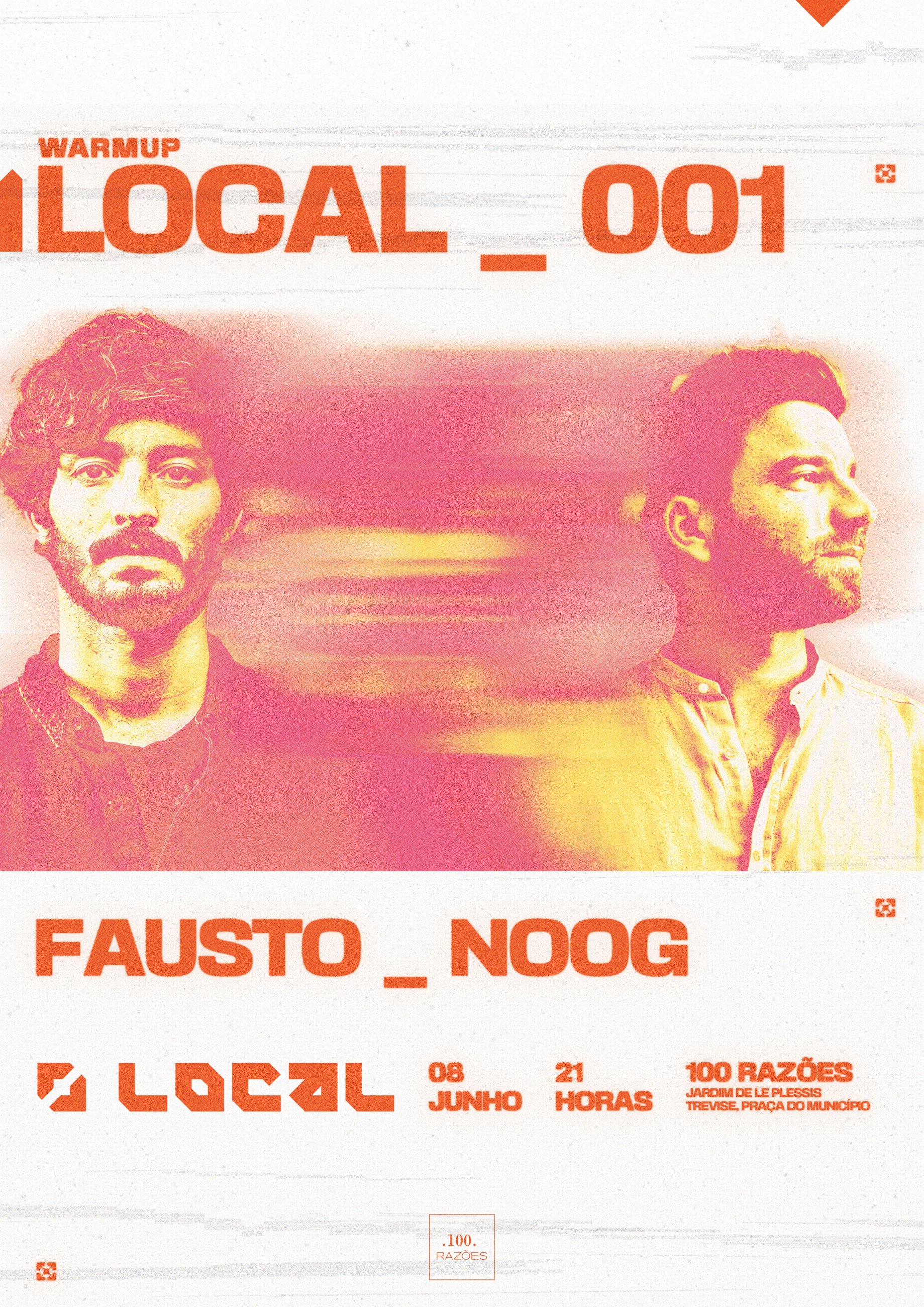
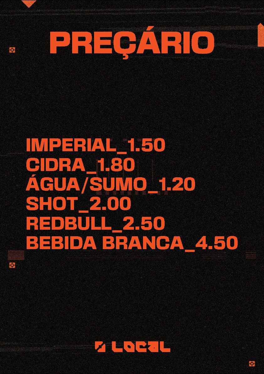
For the first night, I built the campaign around orange, bold line-ups and distorted artist photography. The same visual language runs from the main poster to the individual artist announcements.
One line-up. Three individual moments.
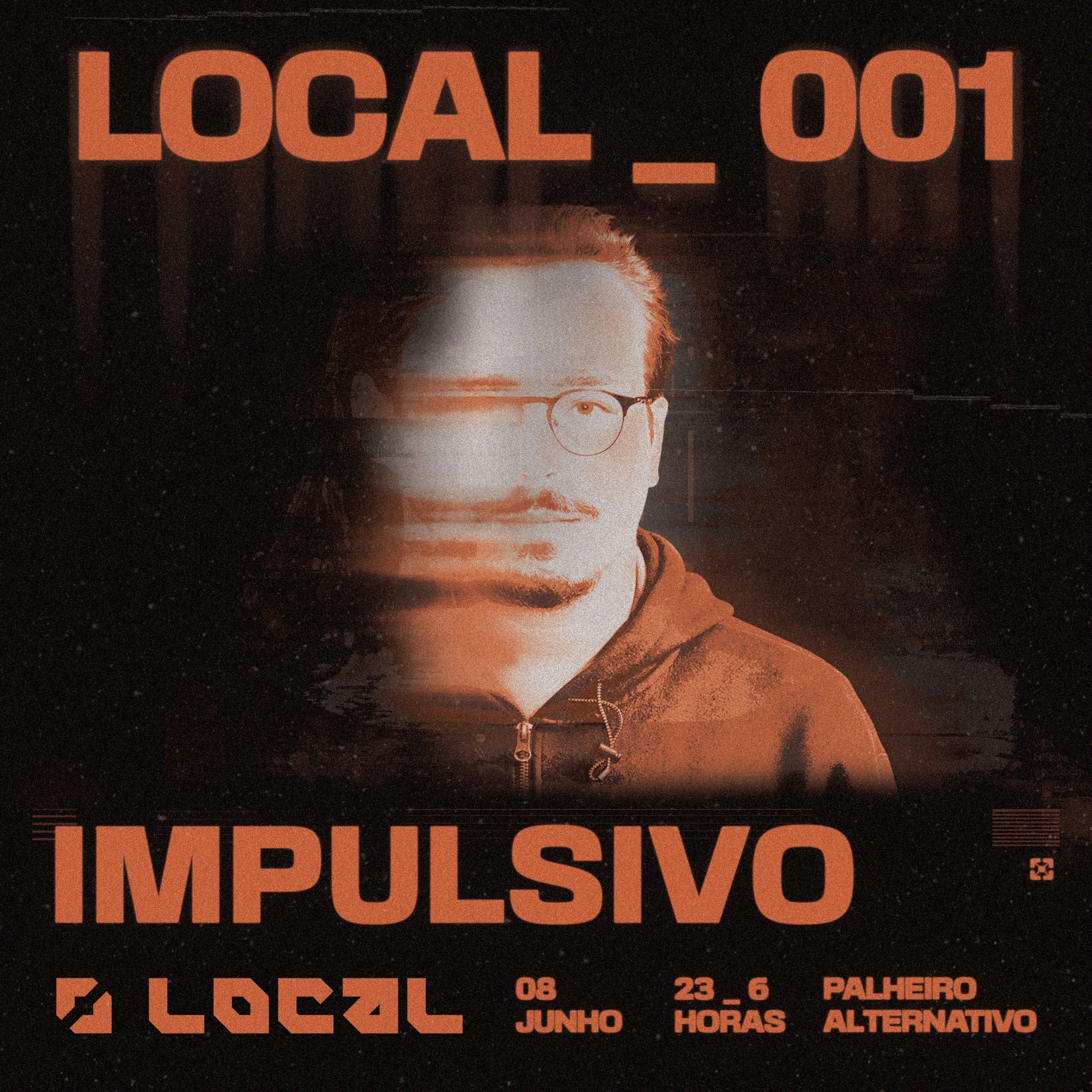
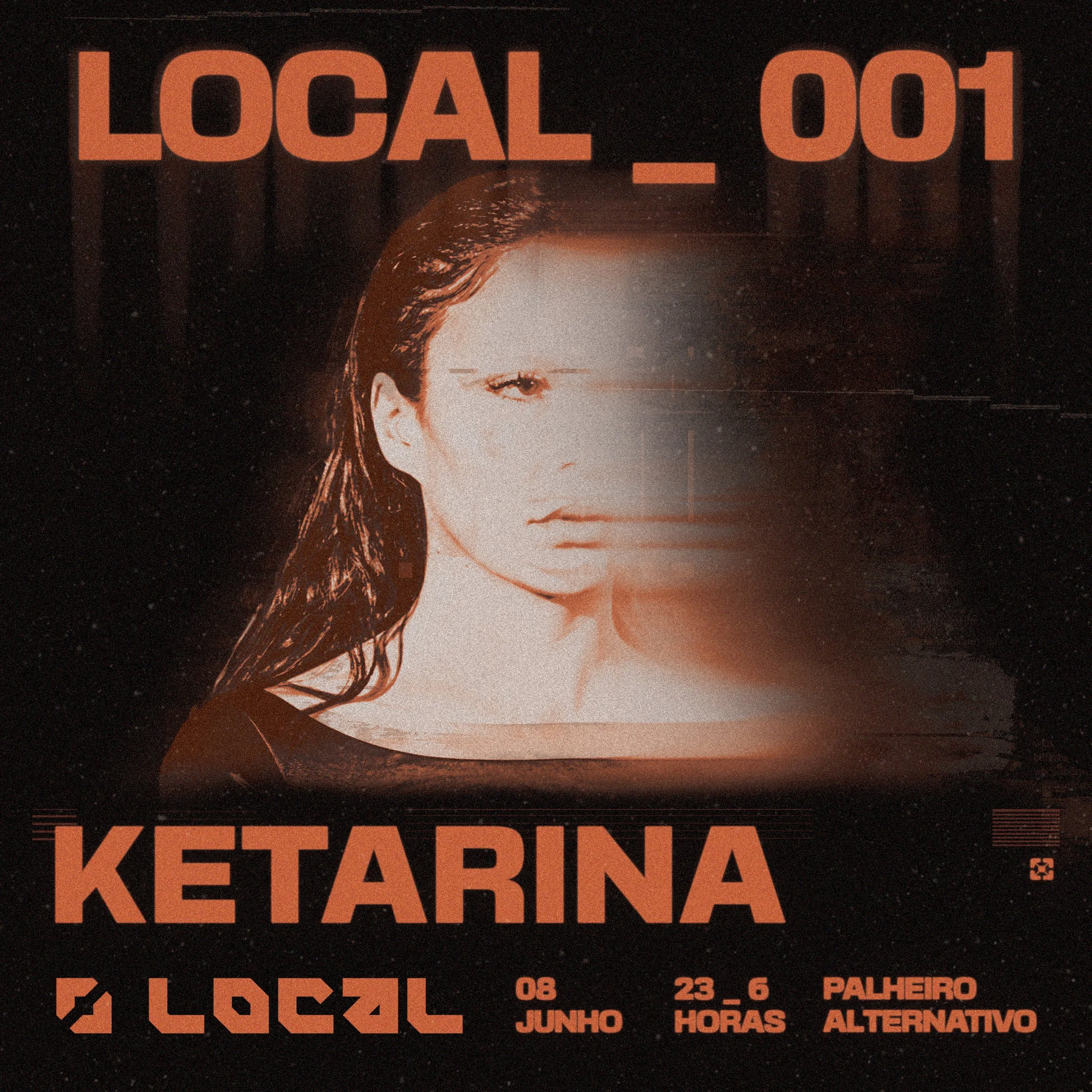
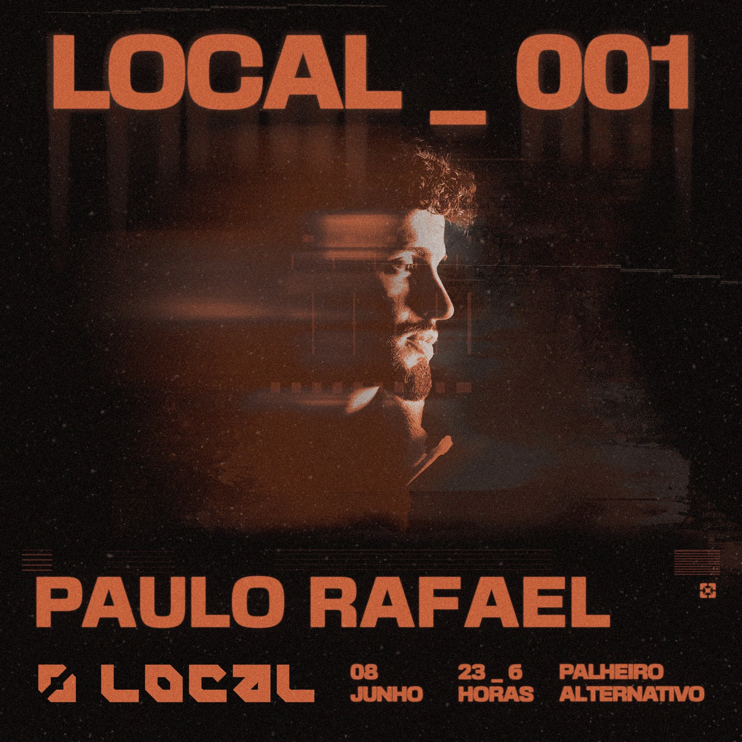
Explore the No.1 event materials
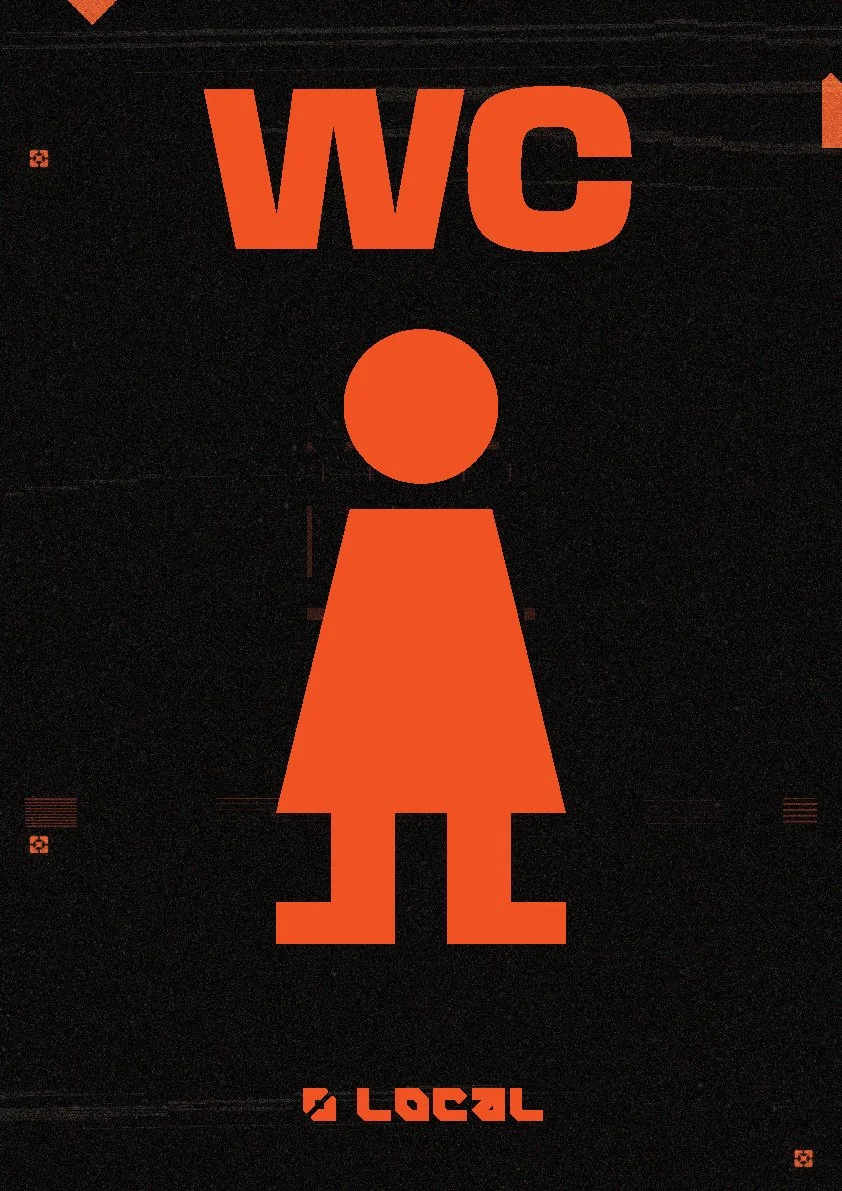
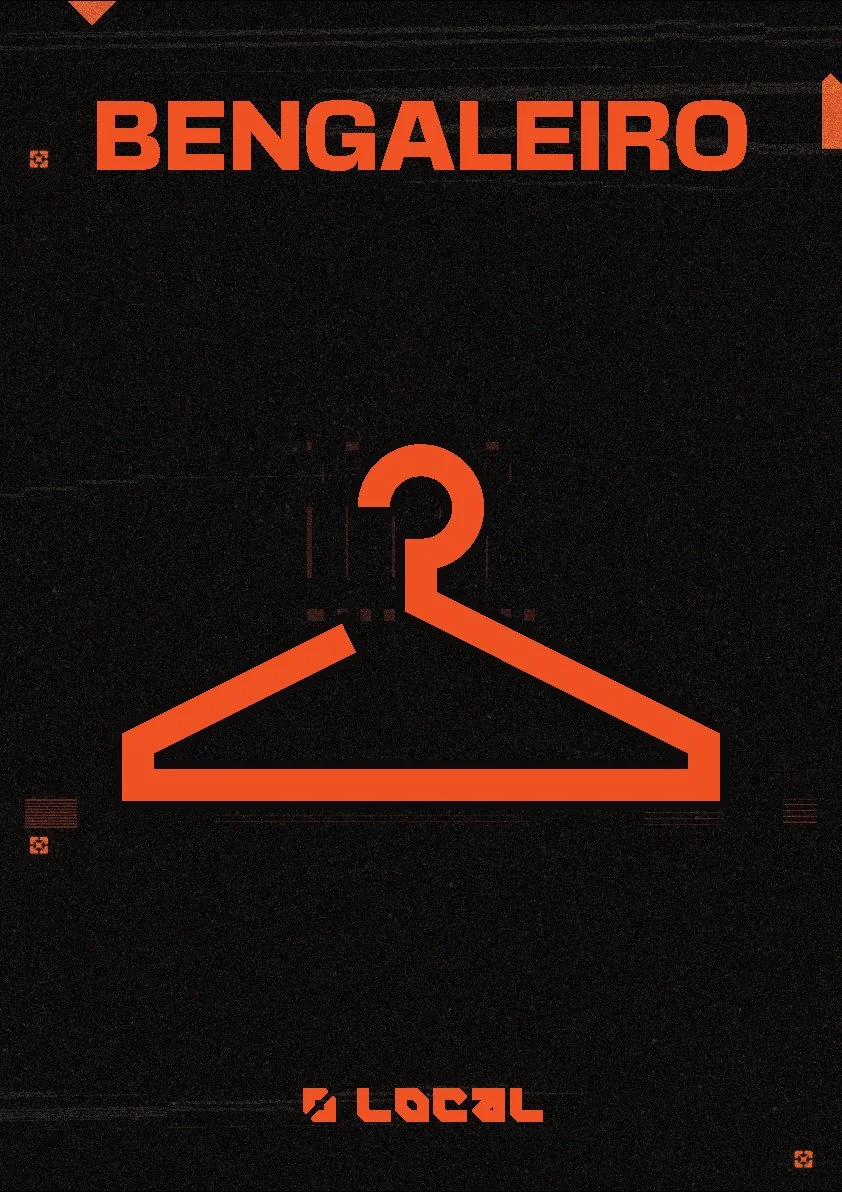
LOCAL No.1 · Event film
LOCAL No.2
A new colour. Same LOCAL.
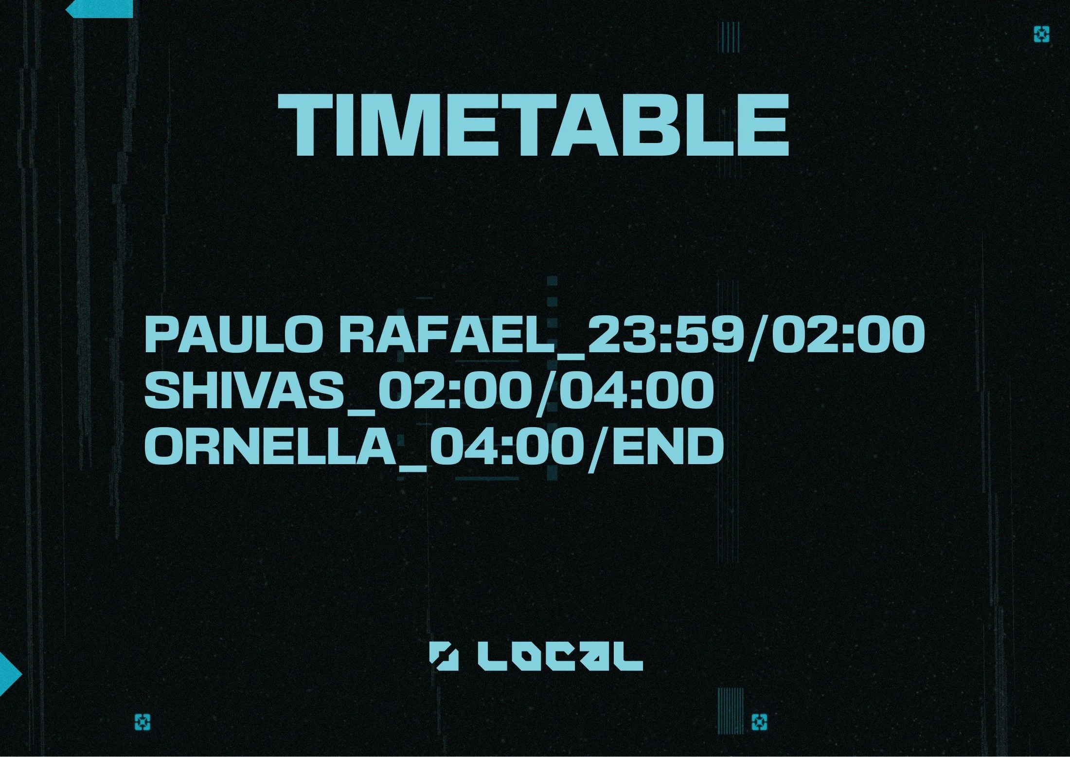
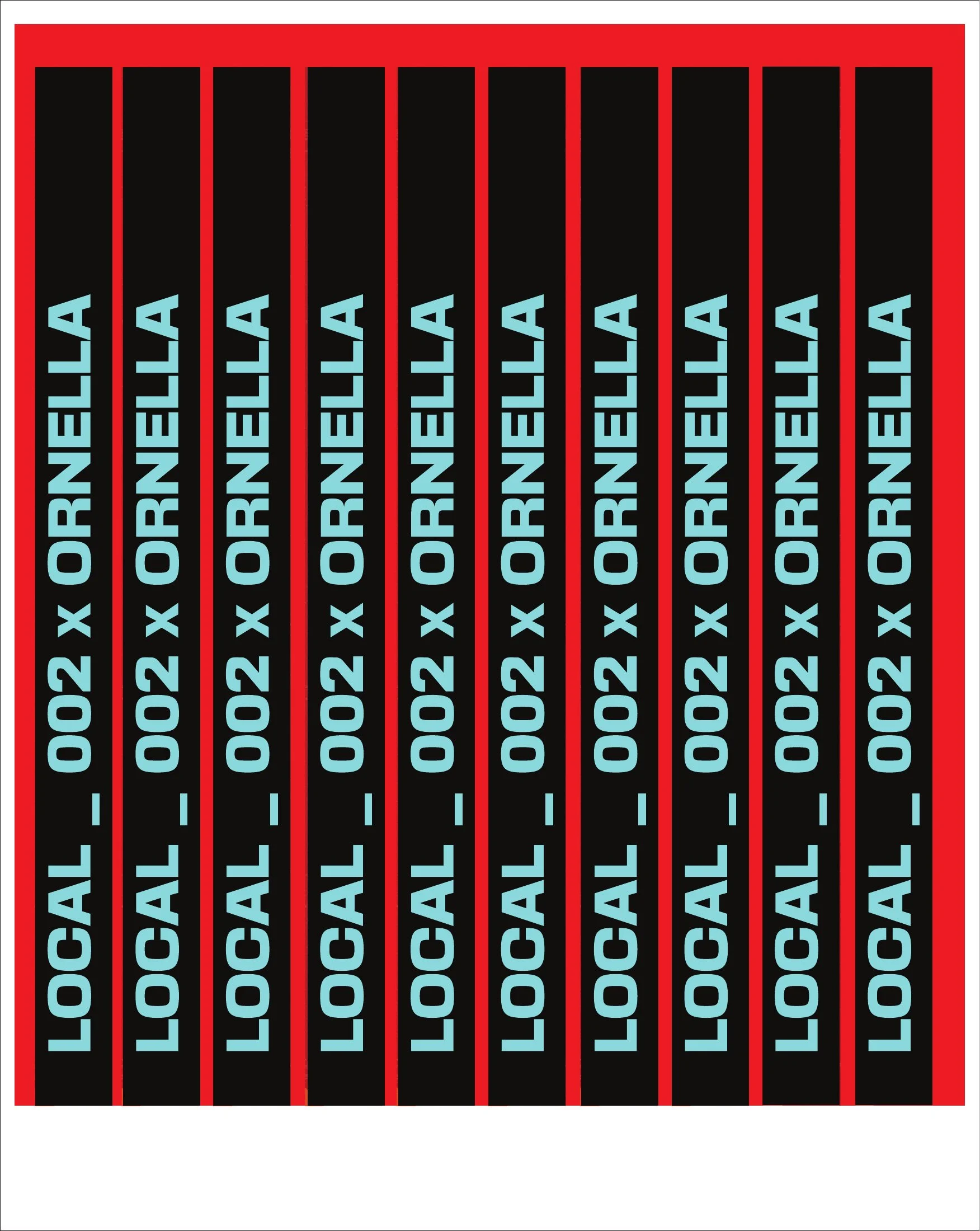
For the second night, turquoise gives the campaign its own identity. The angular logo, texture and bold typography keep it connected to No.1, while the new palette carries through the stationery and signage.
The colour carries into the venue.
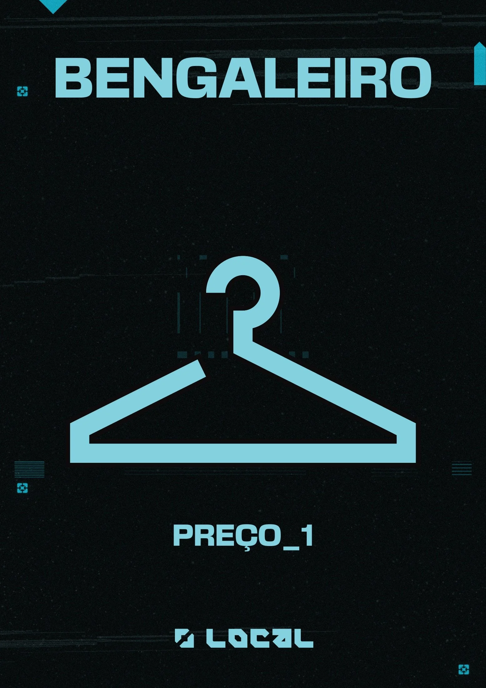
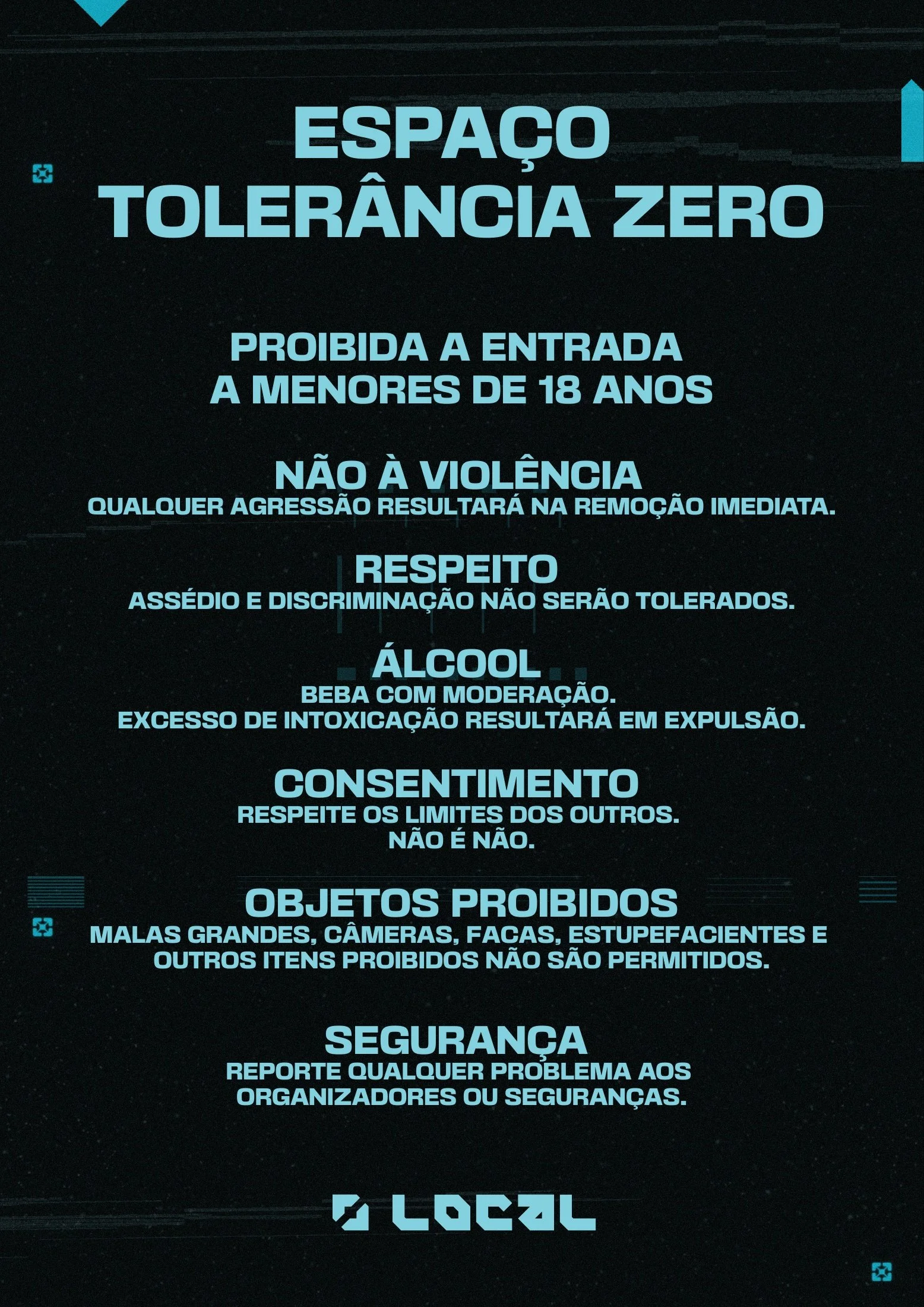
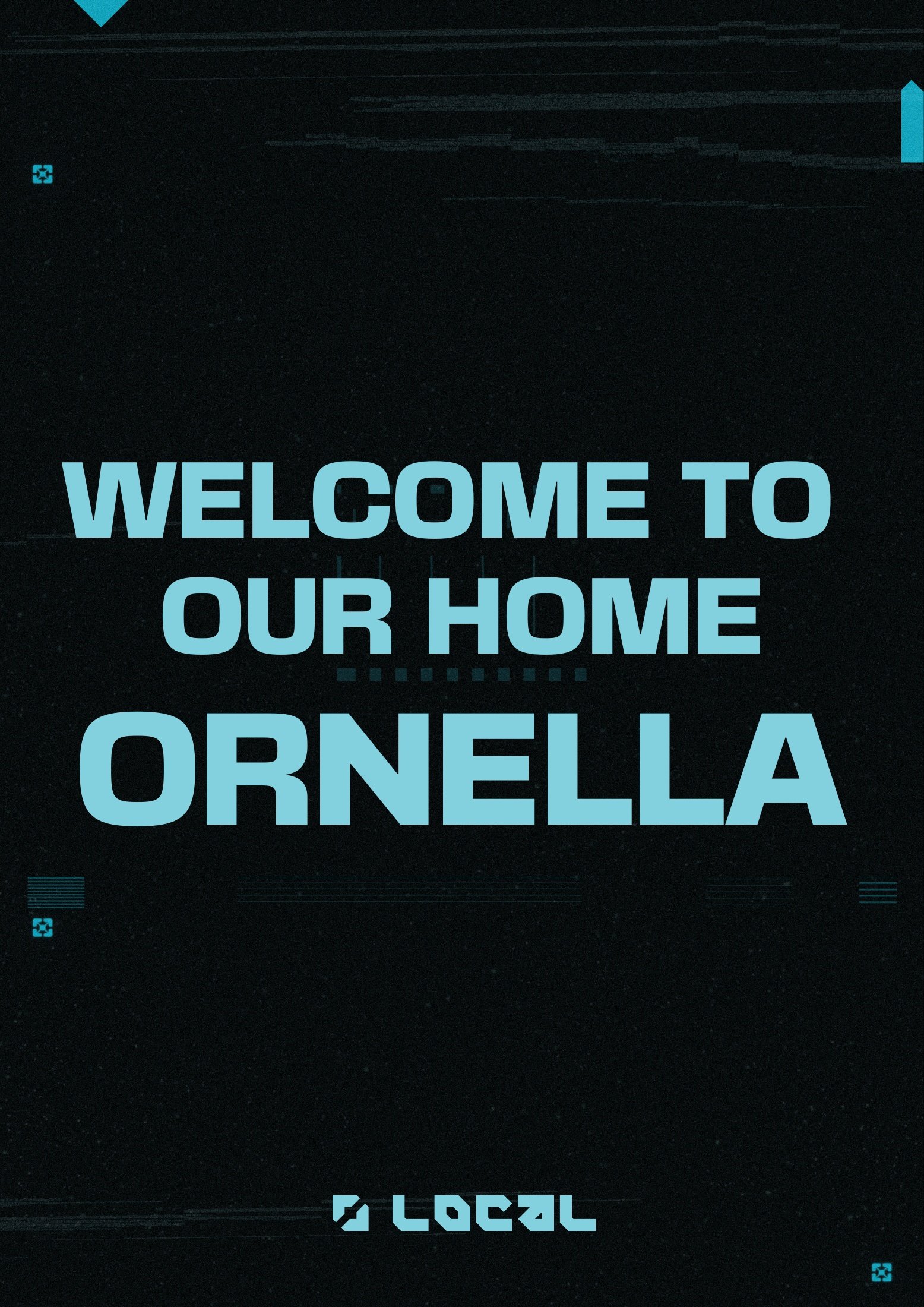
Explore the No.2 event materials
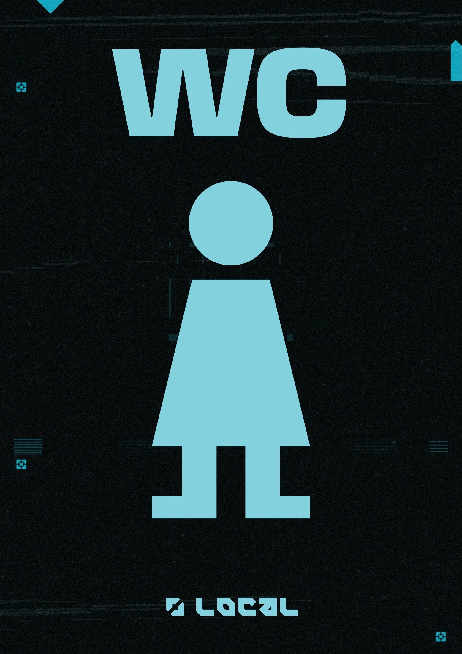
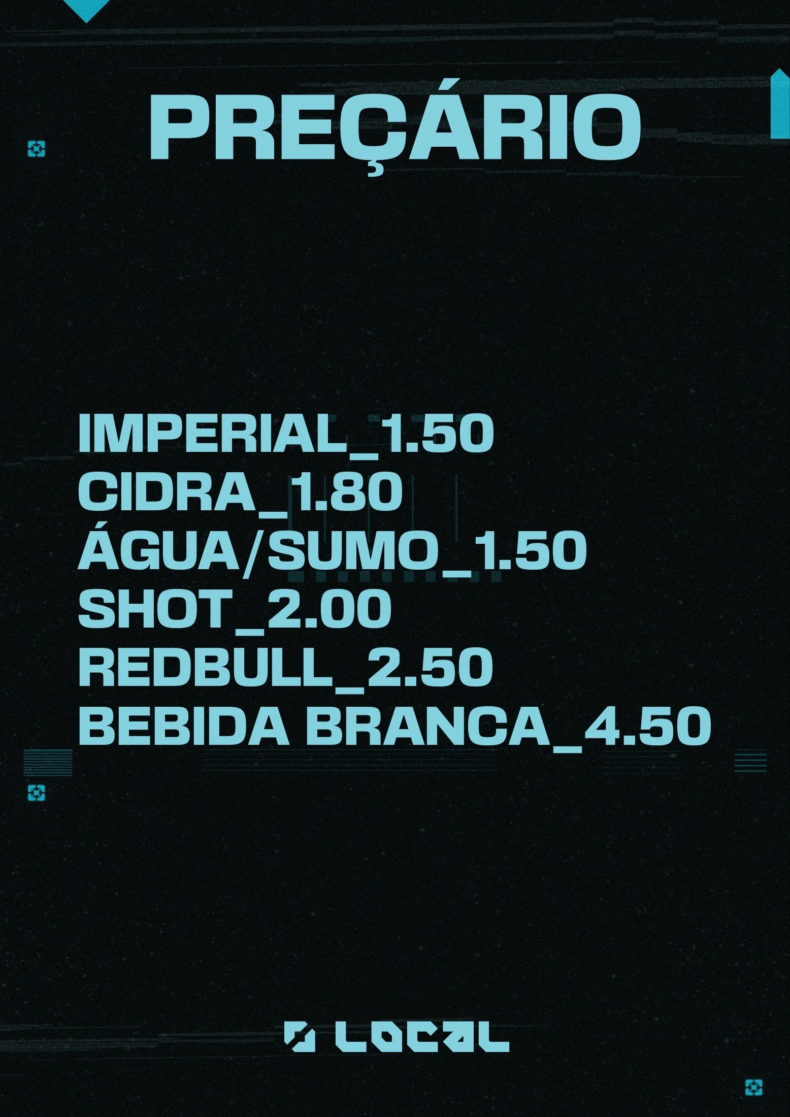
LOCAL No.2 · Event film
Different nights.
A recognisable collective.
The colour changes. The typography, graphic language and structure hold the identity together.