
Flex
Academy
One ambition.
Two starting points.
Make the next step clear.
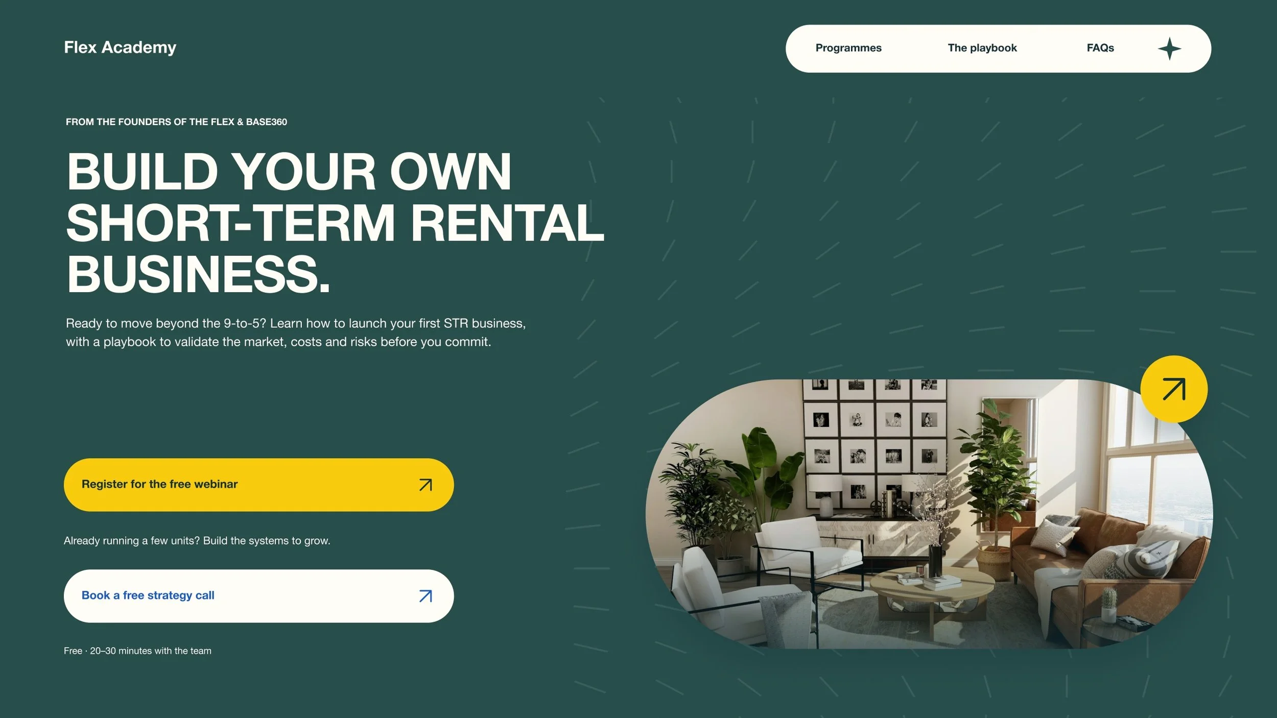
Flex Academy teaches the playbook behind The Flex and Base360. The brief was to design its front door: one landing page for two audiences, with a clear route for each. I designed a landing-page proposal that brings the offer, visual direction and sign-up journeys together. The focus was on helping visitors see where they fit and feel ready to take the next step.
Launch
Someone with no units, or just one, looking to move beyond the 9-to-5. They need a practical starting point and a way to understand the risks before committing.
Scale
An operator with a few units, stretched by manual work and thin margins. They need systems and support to grow into a company.
Lead with Launch.
Keep Scale easy to find.
Newcomers are the primary audience, so I gave the free webinar the strongest emphasis in the hero. The strategy call stays visible alongside it, with copy that helps existing operators recognise their route.
Trust before the pitch
I brought the connection to The Flex and Base360 near the top. The page explains where the playbook comes from before asking visitors to choose a programme.
Compare without guessing
The programme cards use the same structure: who it is for, what is included and the next step. X and Y remain clearly labelled placeholders while the programme pricing is being defined.
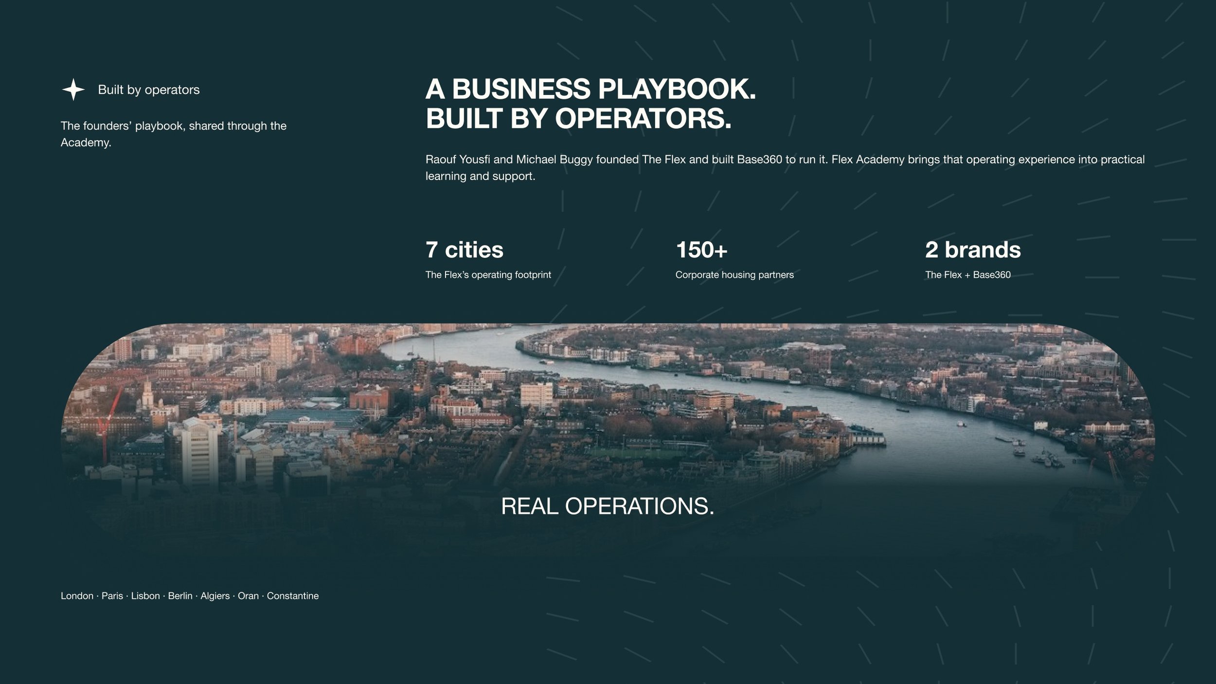
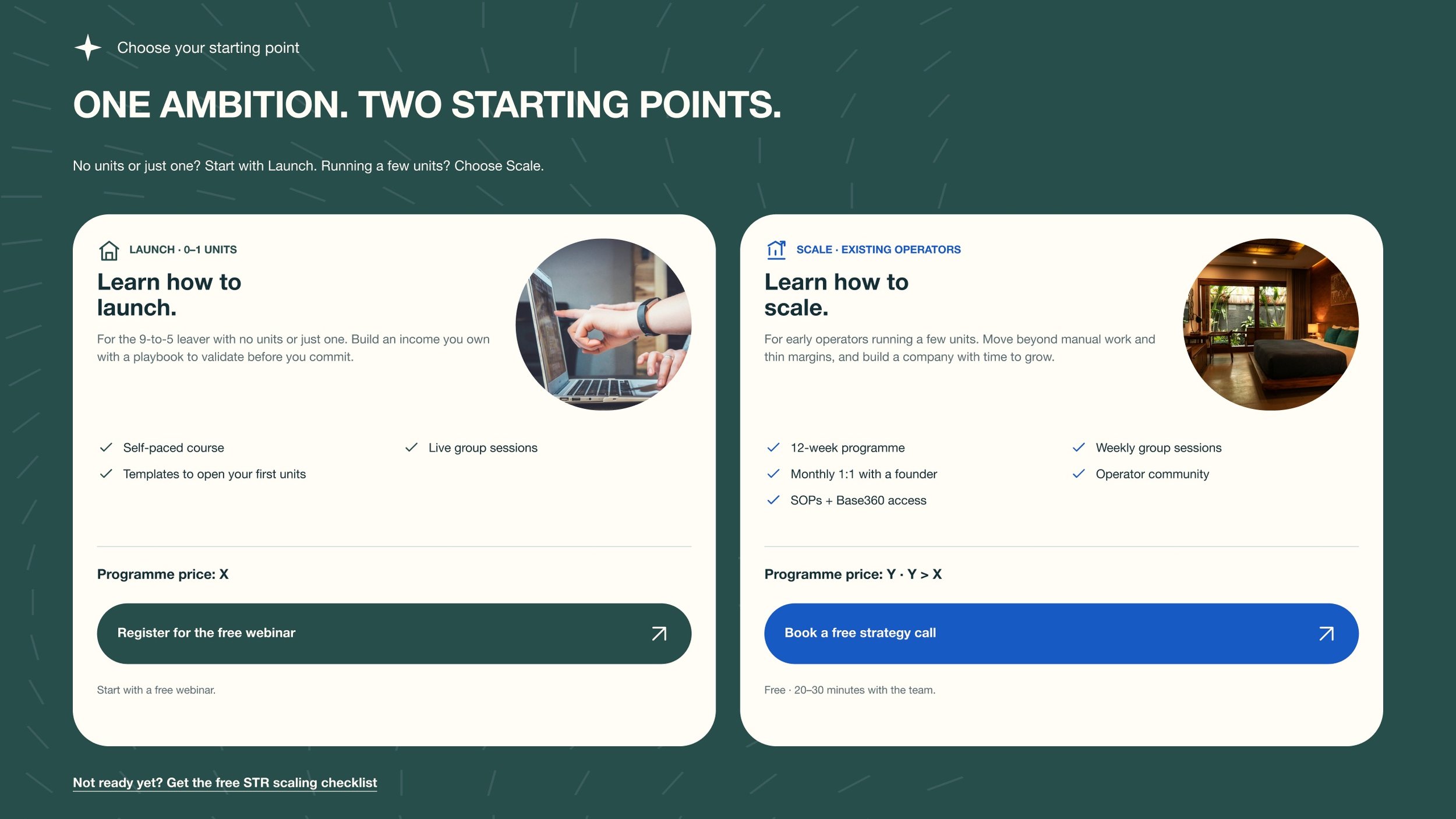
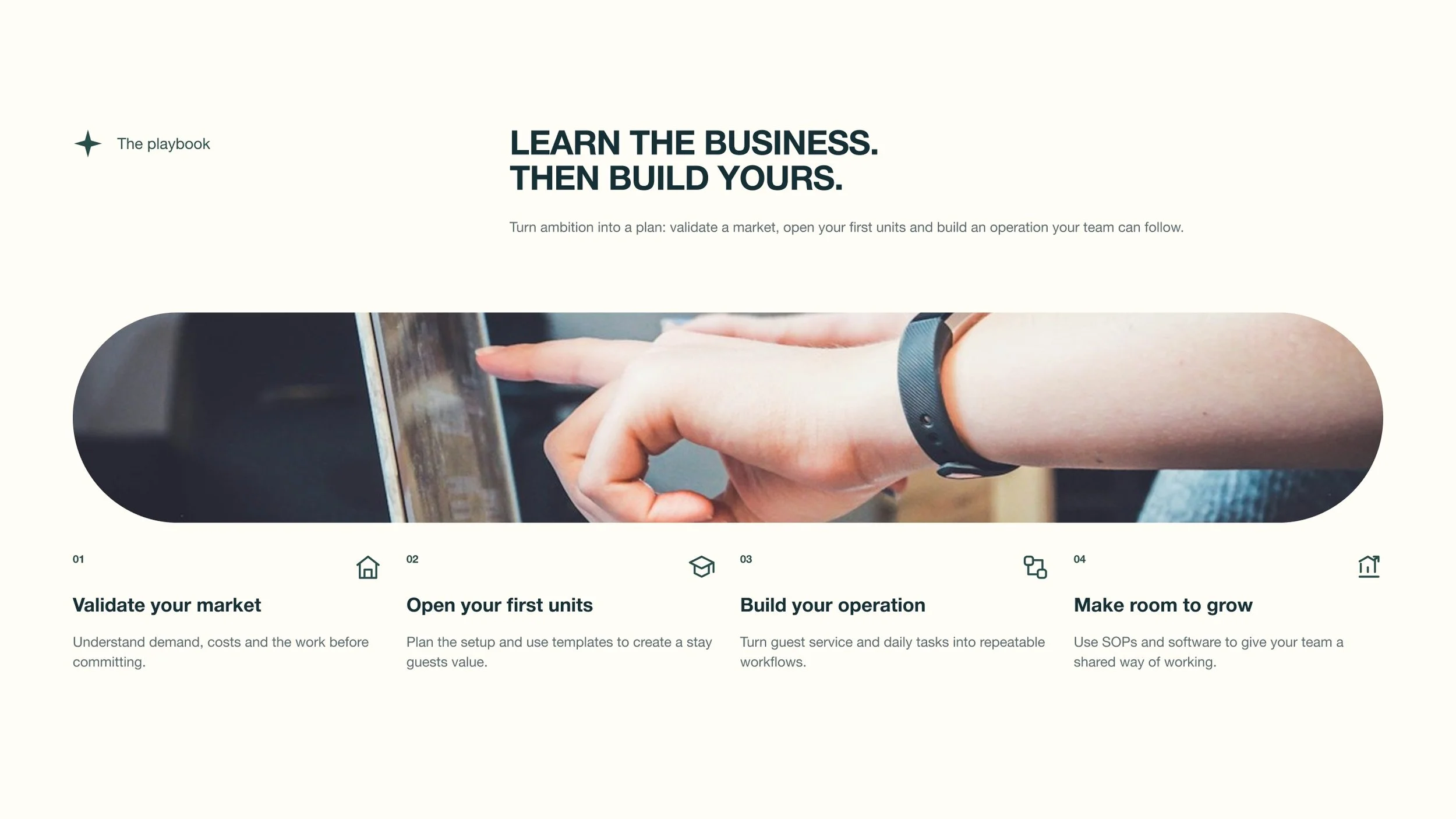
The visual direction pairs deep green and cream with rounded forms and property photography. Yellow brings attention to the main webinar action, while blue helps distinguish the Scale route. I wanted the Academy to feel related to the existing businesses, with its own learning-focused identity.
See the rest of the desktop page
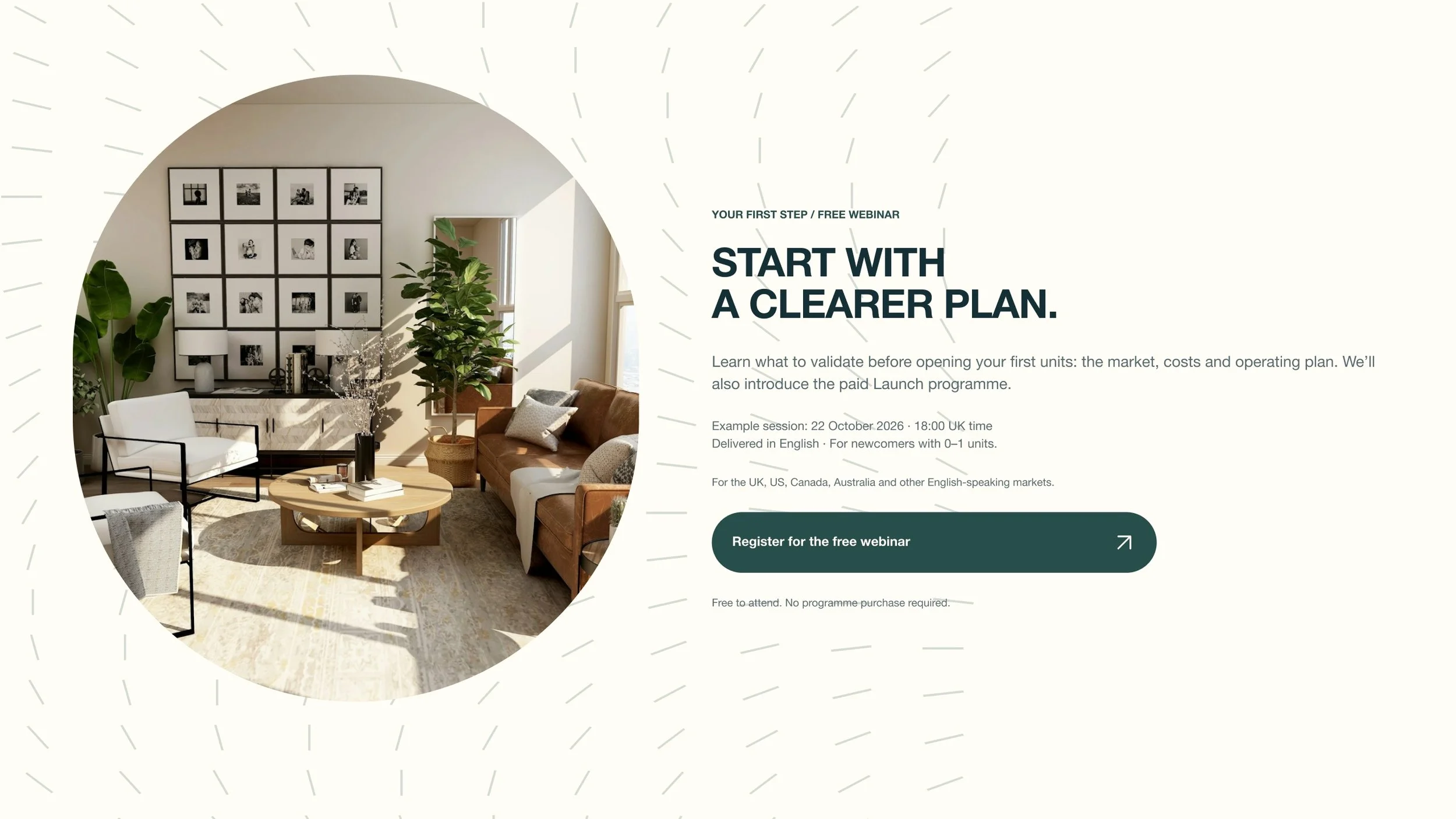
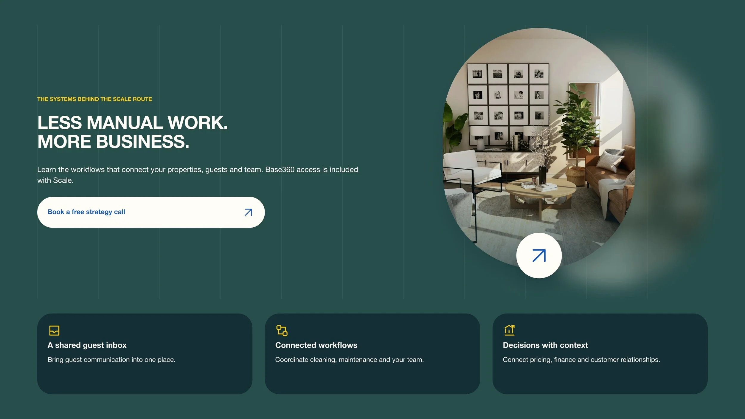
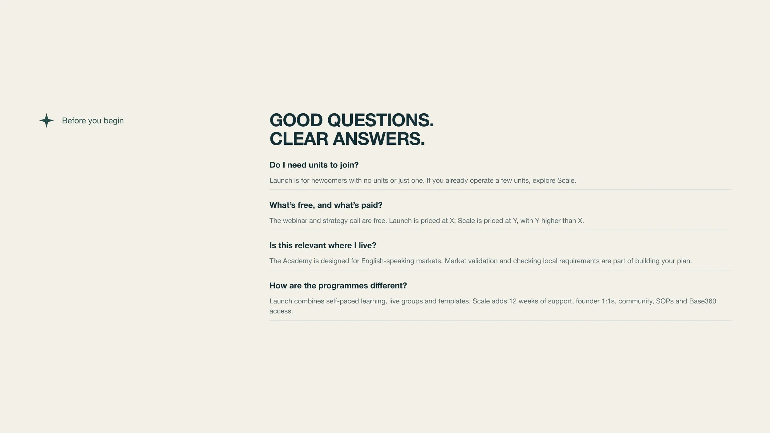
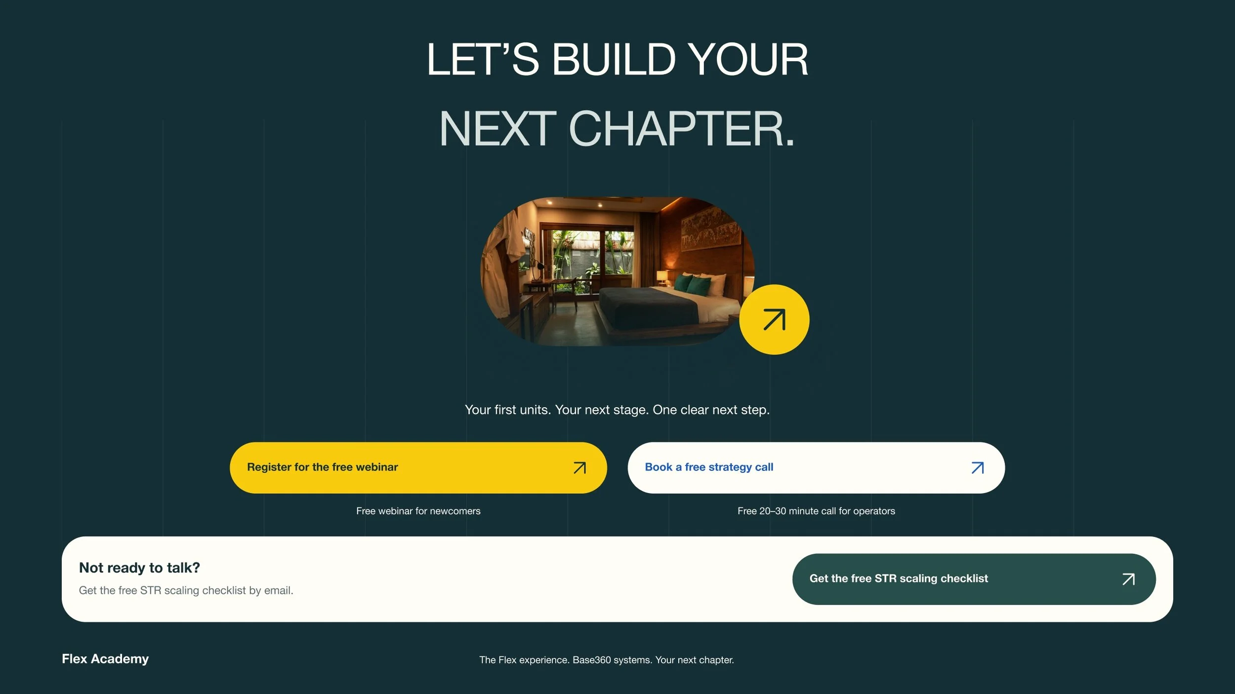
Design beyond the button.
I carried the proposal through the steps after each CTA, so the form, booking and confirmation feel like one continuous experience.
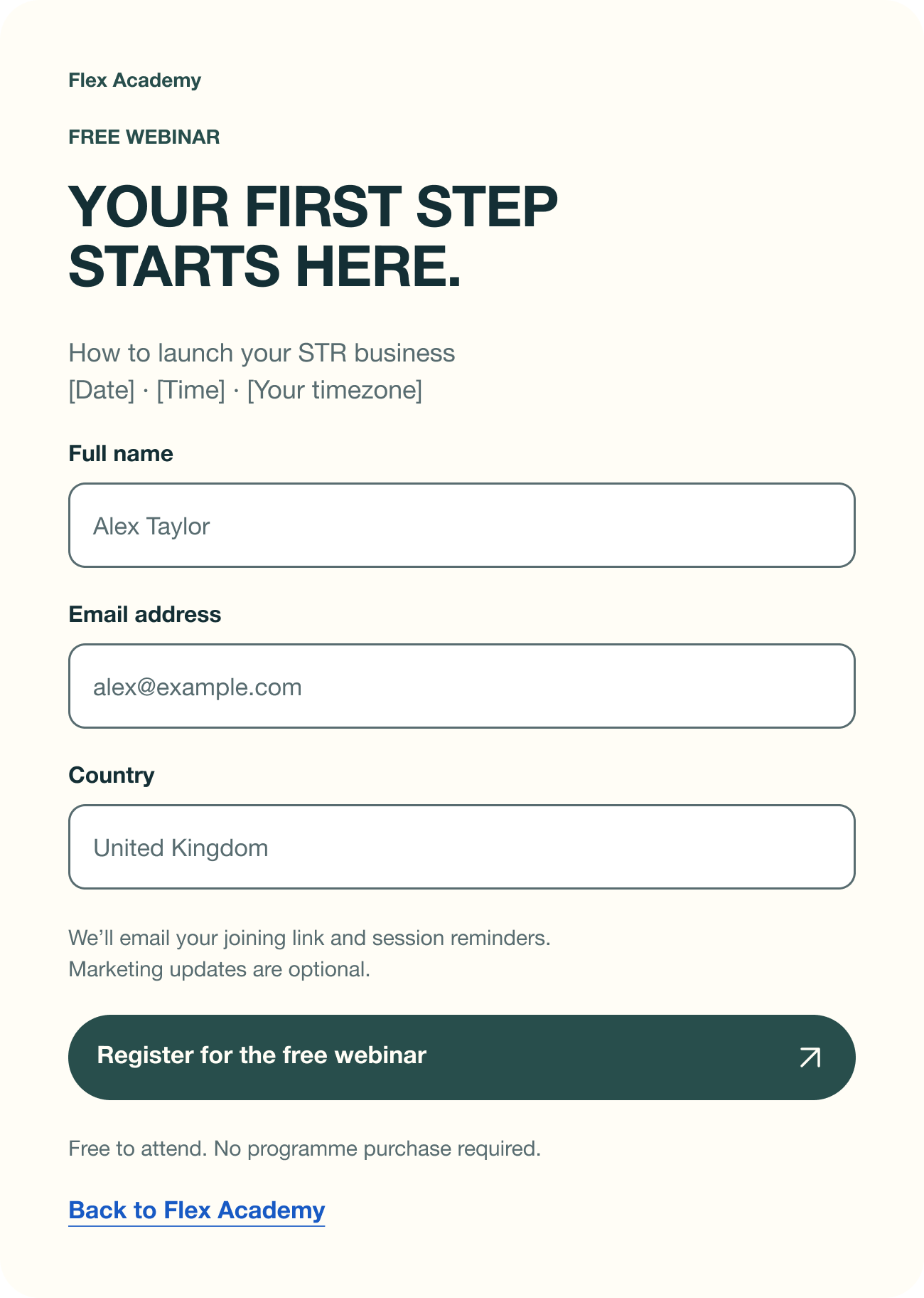
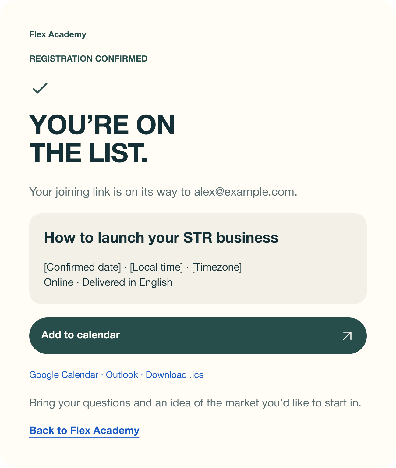
Launch: register → confirm
A short registration step leads to a confirmation with the webinar details and an add-to-calendar action.
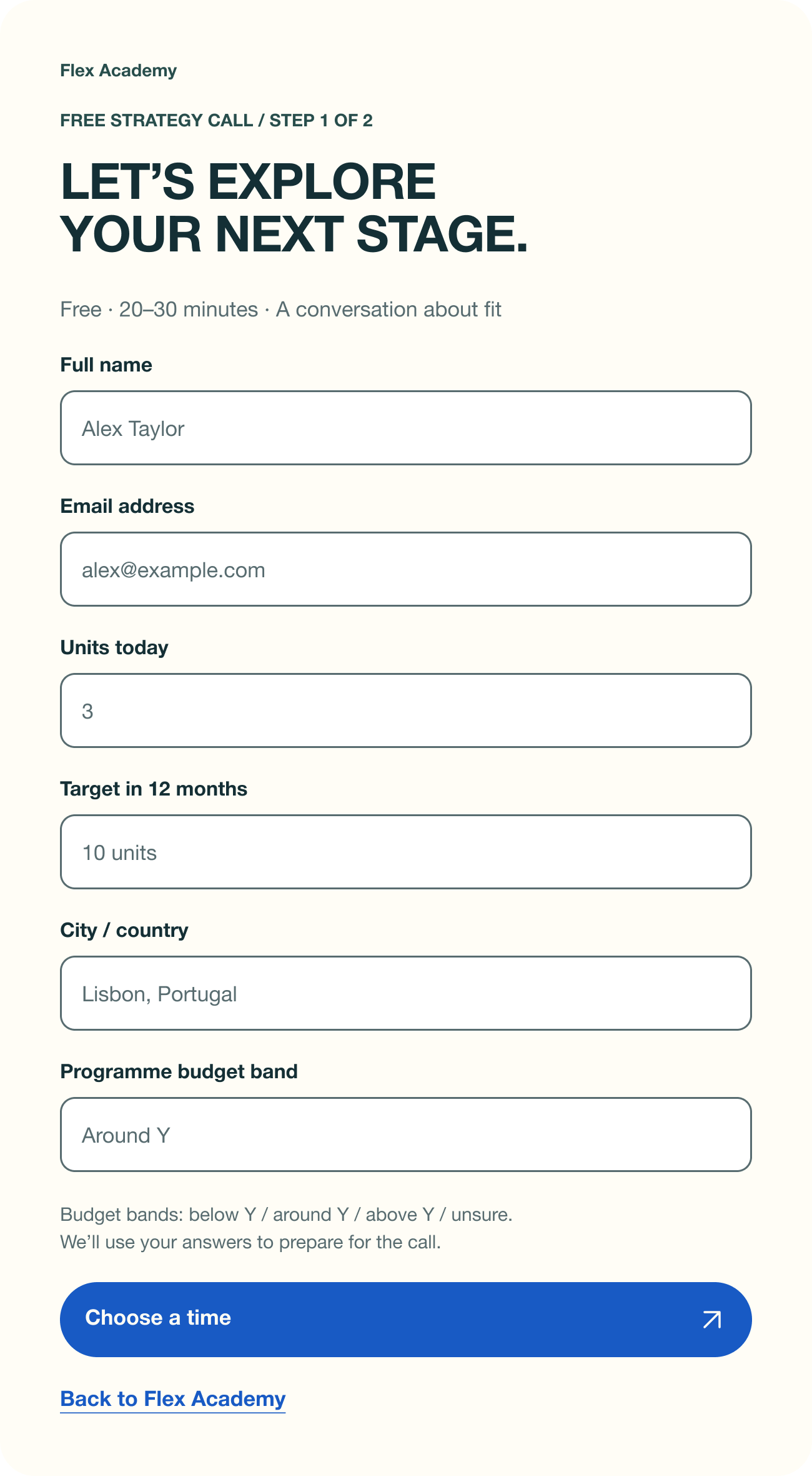
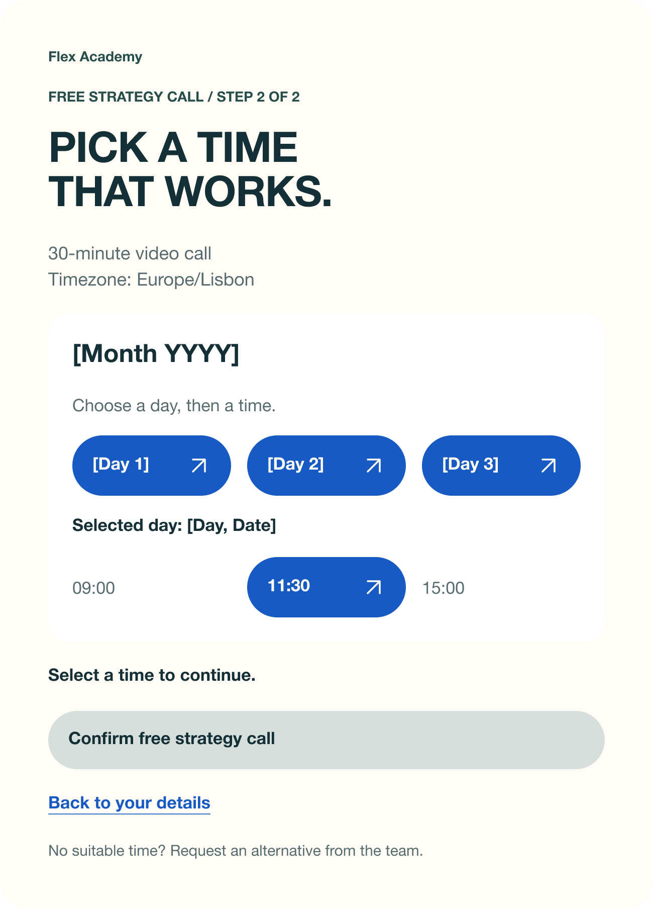
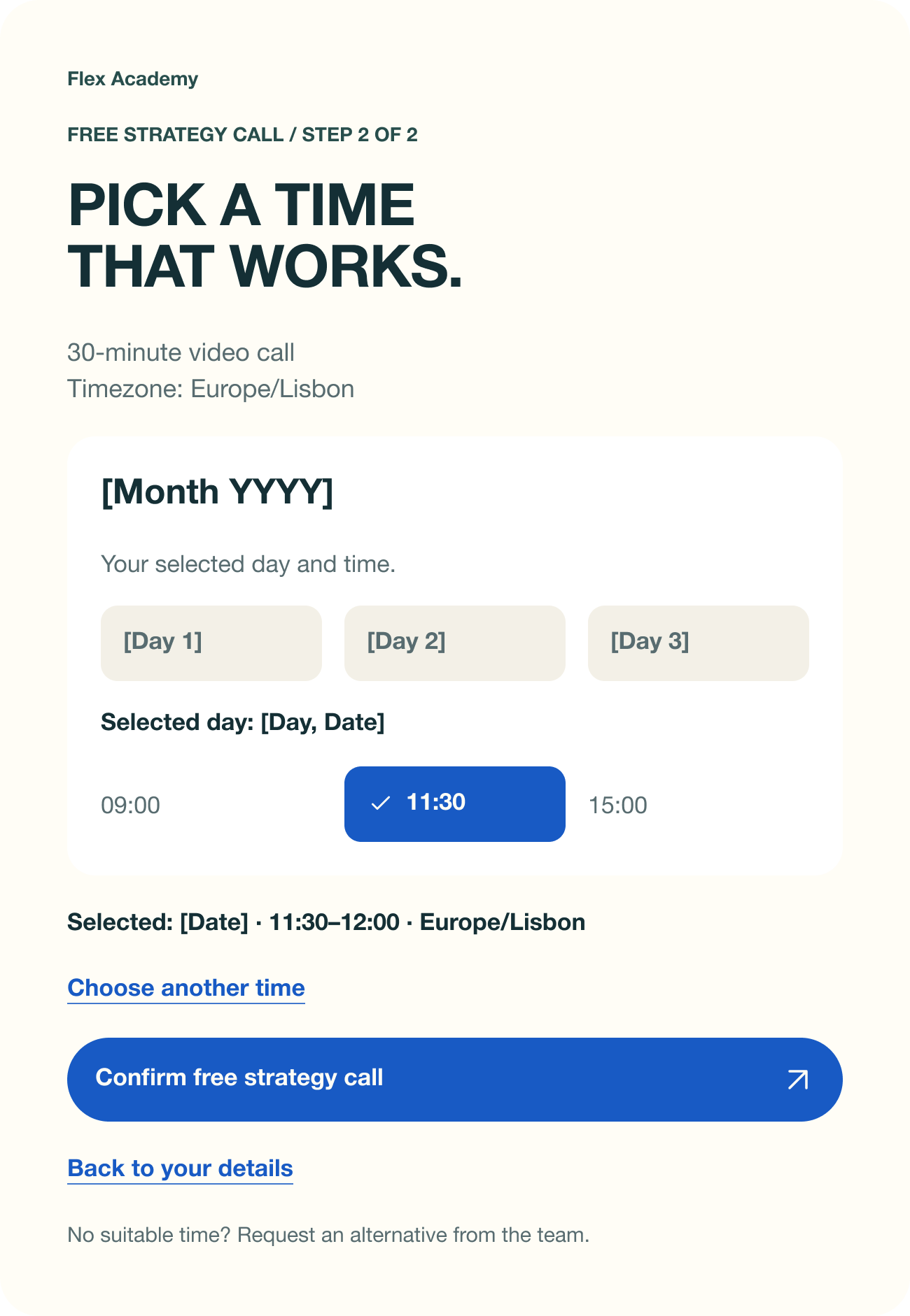
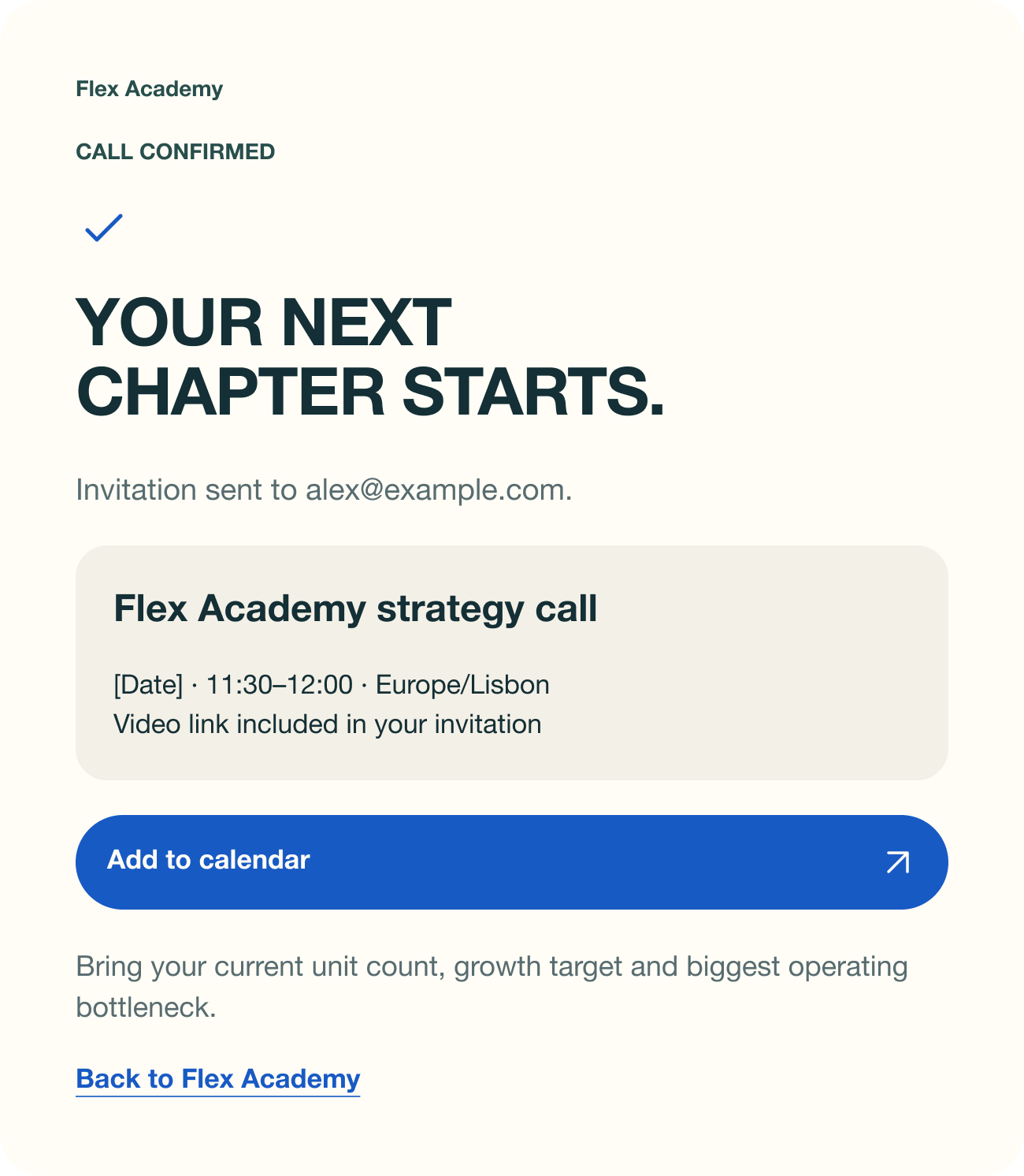
Scale: qualify → choose a time → confirm
The strategy call starts with context about the operator’s business, then moves to the calendar, a selected slot and a clear booking confirmation.
For visitors who are not ready for either route, the page offers a free STR scaling checklist. It gives them a smaller next step without competing with the two main actions.
Same choices.
A different rhythm.

On mobile, the two routes stack into a single reading order. Launch stays first, and the programme cards keep the same labels and action language as desktop.
I focused the mobile work on the hero and programme comparison: the places where visitors need to understand the offer and choose their path.
What I would test next.
The next step would be to validate the proposal with prospective learners. I would first test whether newcomers and existing operators choose the intended route without explanation, then watch for friction in registration and booking.
Clarity first
Can someone explain who the page is for and what happens after the CTA, after a quick look at the hero?
Commitment next
Where do people hesitate in the forms, and do the confirmation screens answer what happens next?