
Valeo
Compliance
in Action.
Designed for Valeo through TransPerfect.Explore the project ↓
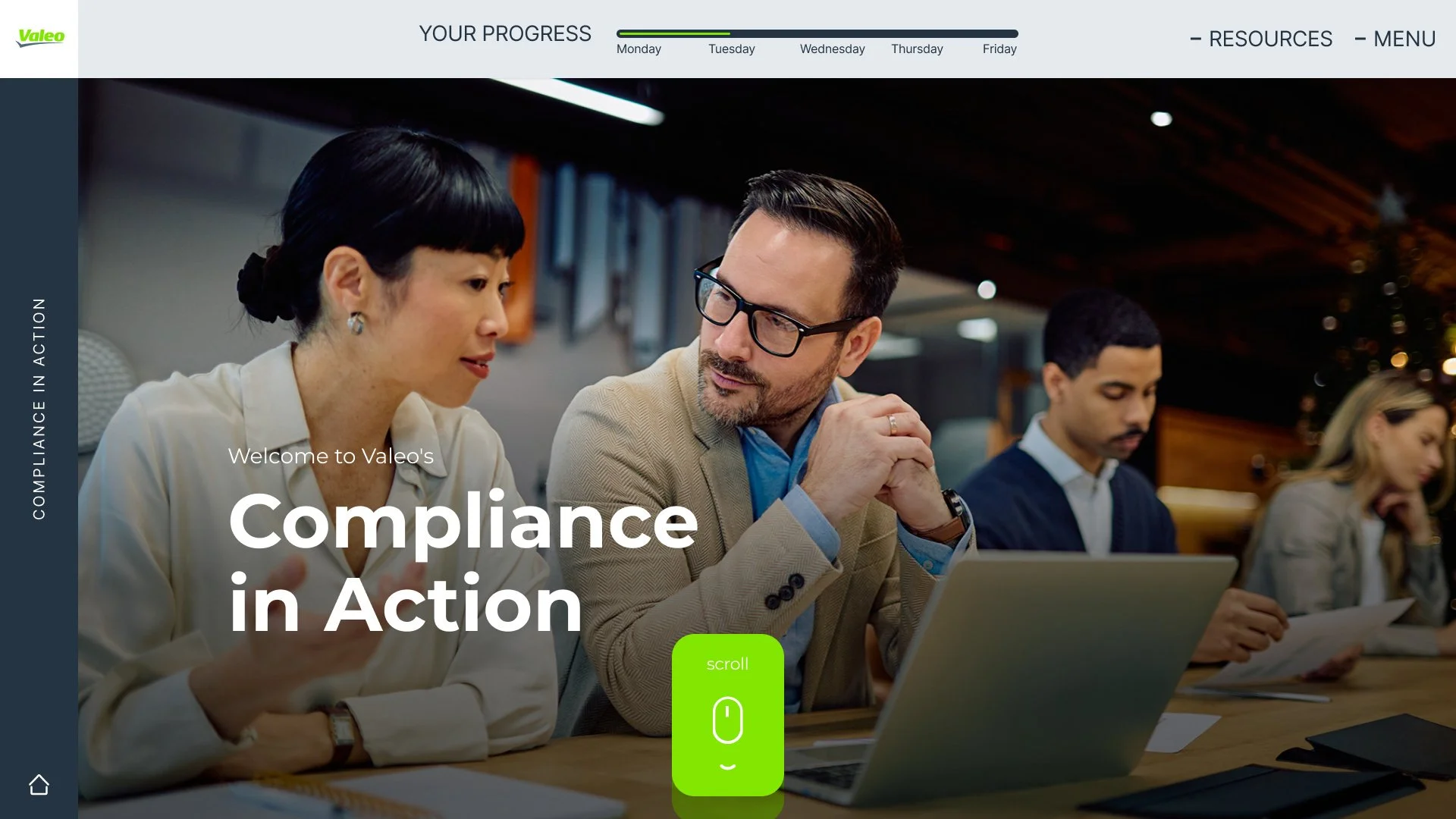

From policy to practice.
I designed the UX/UI for Compliance in Action, a training programme for Valeo through TransPerfect. The experience follows Dan through a working week, turning compliance topics into situations where learners need to decide what to do next.
My focus was making a content-heavy programme feel clear and easy to move through. The interface gives the story, guidance and decisions their own space, while keeping progress and navigation consistent.
A week in Dan’s shoes.
- Get oriented
- Meet the situation
- Explore the guidance
- Choose an action
- Learn from feedback
Start with a clear purpose.
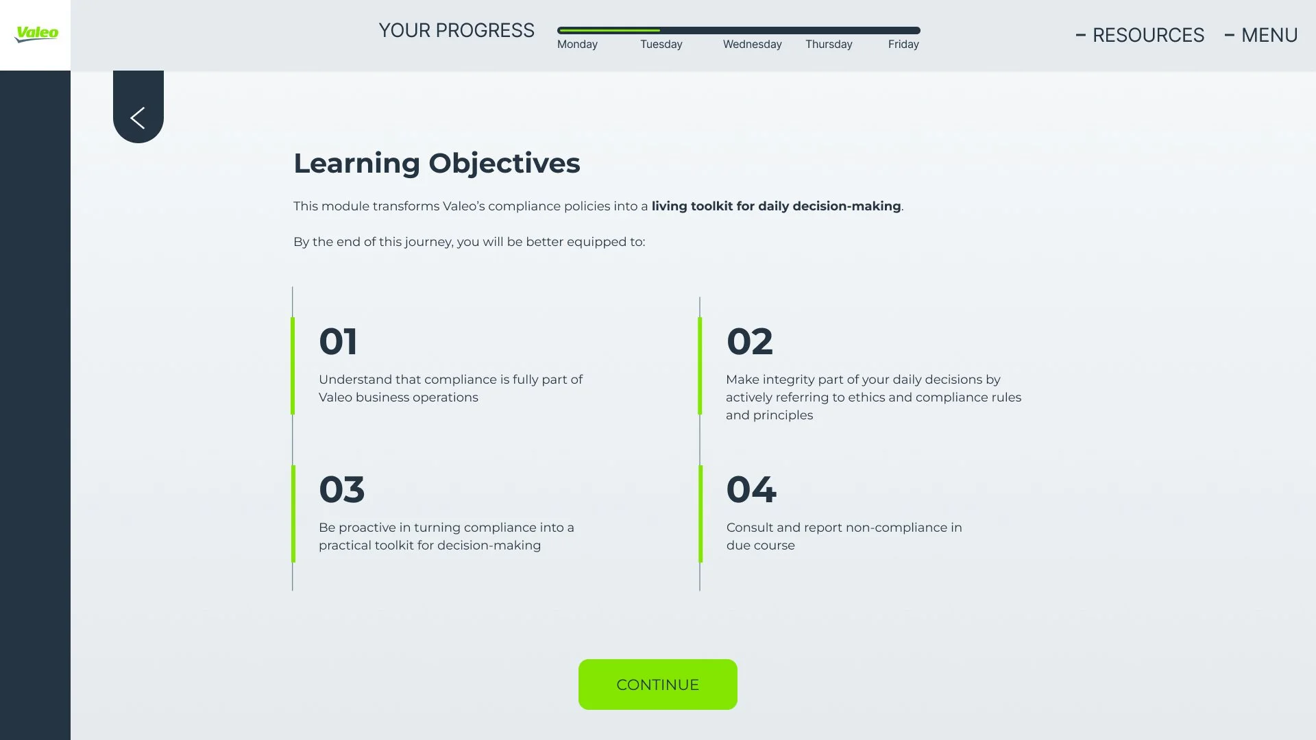
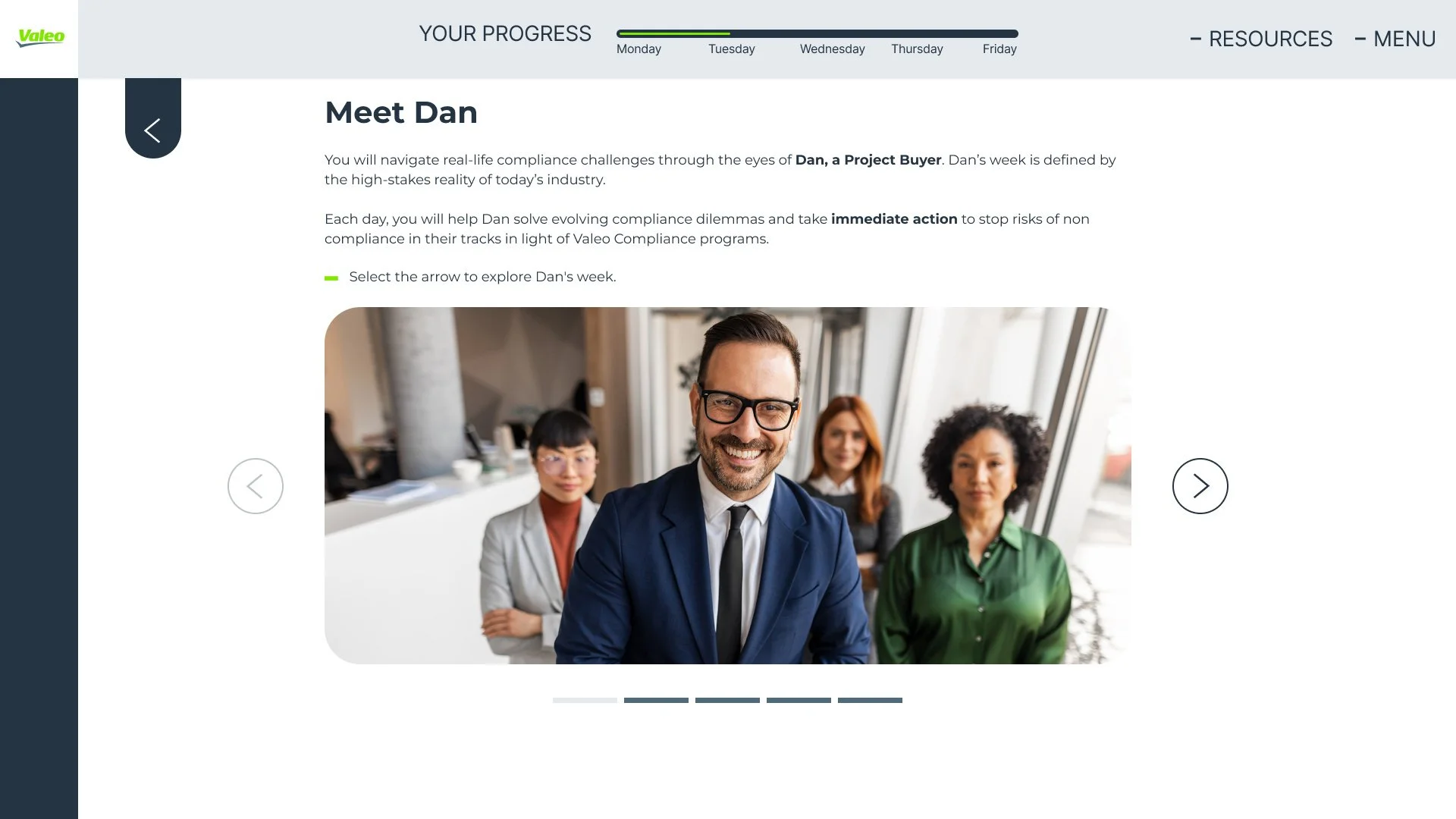
The introduction sets out what learners will practise. Meeting Dan gives them a character to follow, and the Monday-to-Friday progress bar keeps the wider journey visible.
Put the learner inside the situation.
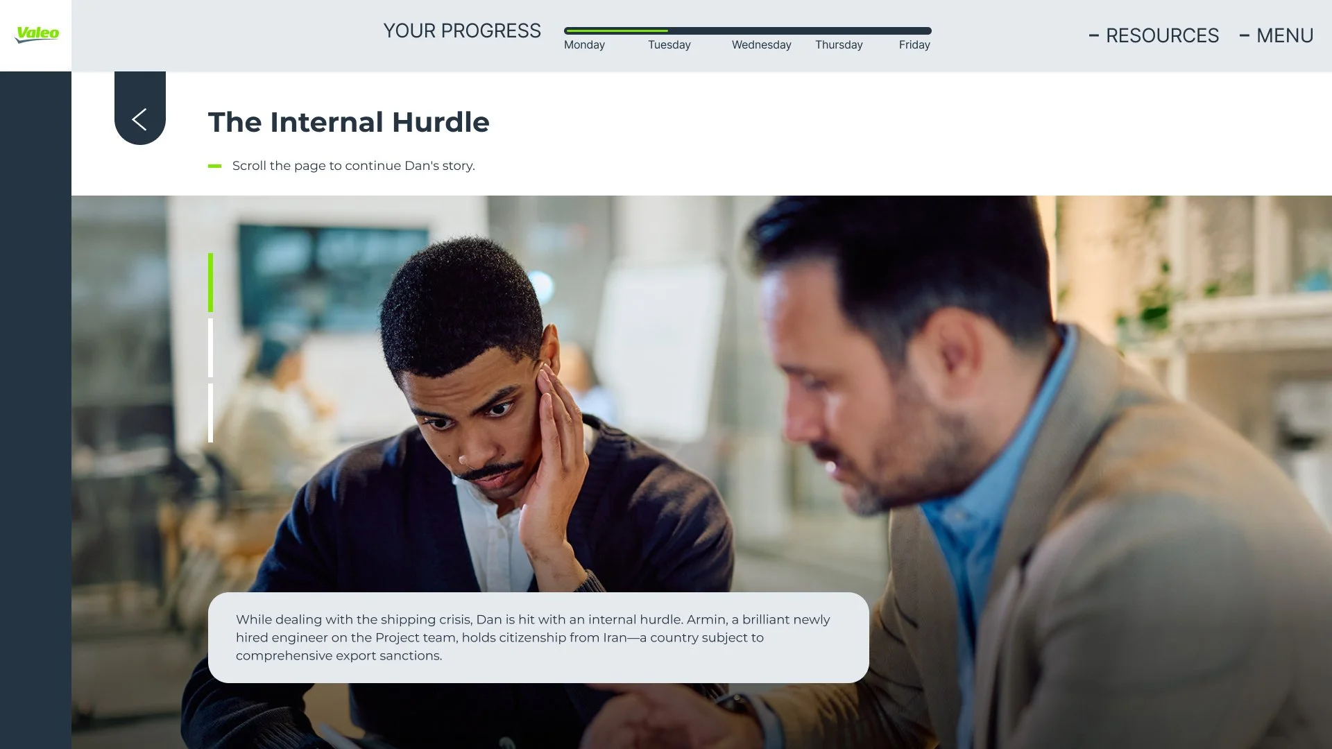
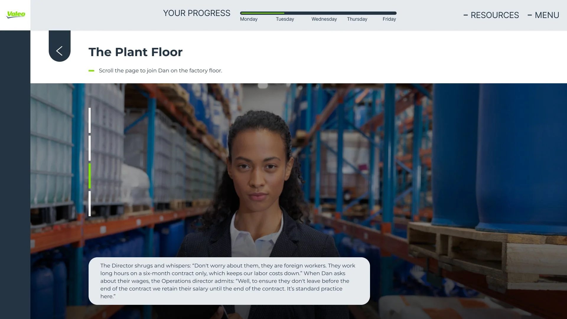
Workplace scenes introduce the dilemma before asking for a decision. Short story steps and a single Continue action give each moment a clear reading order.
Give them somewhere to look.
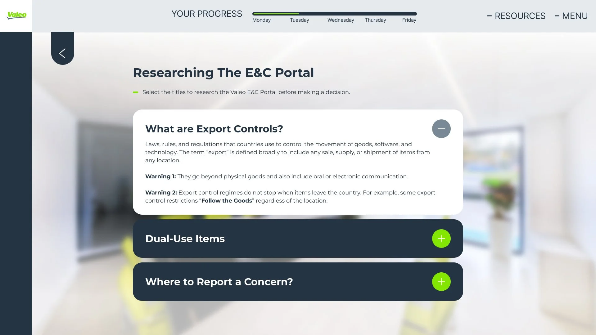
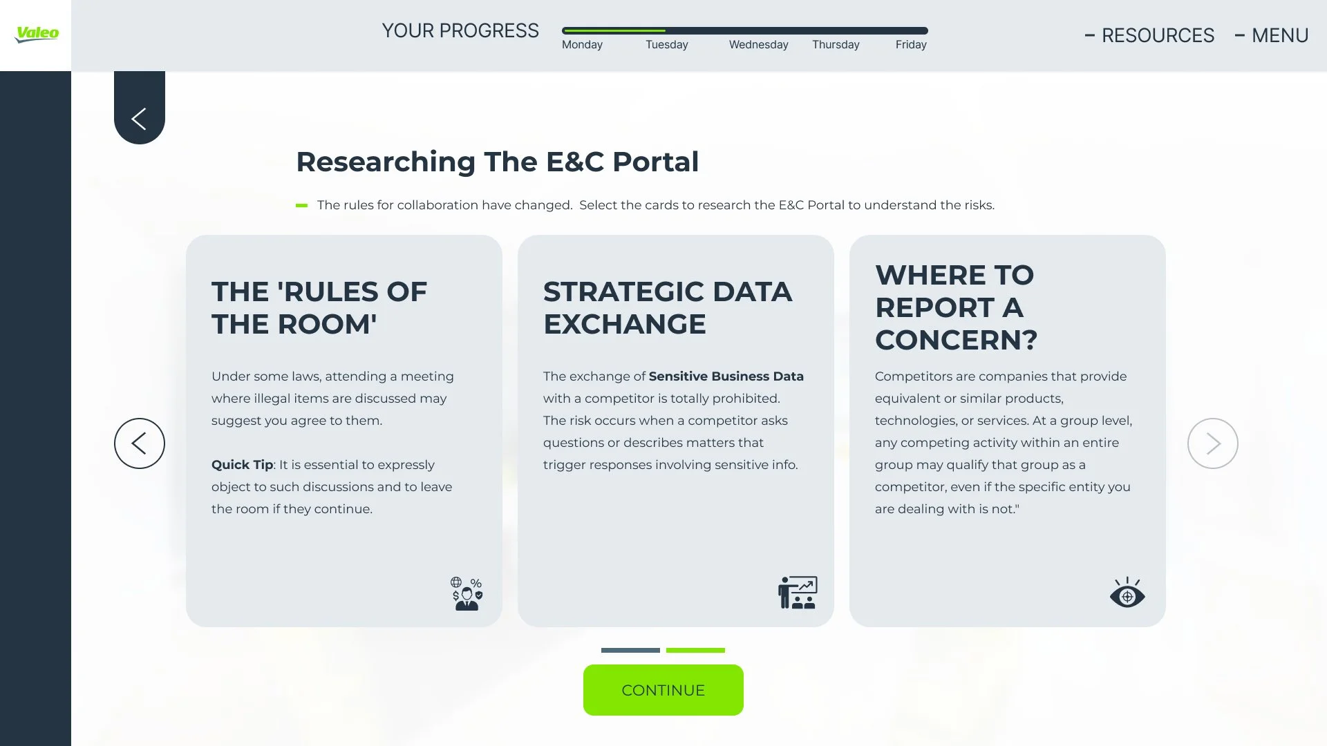
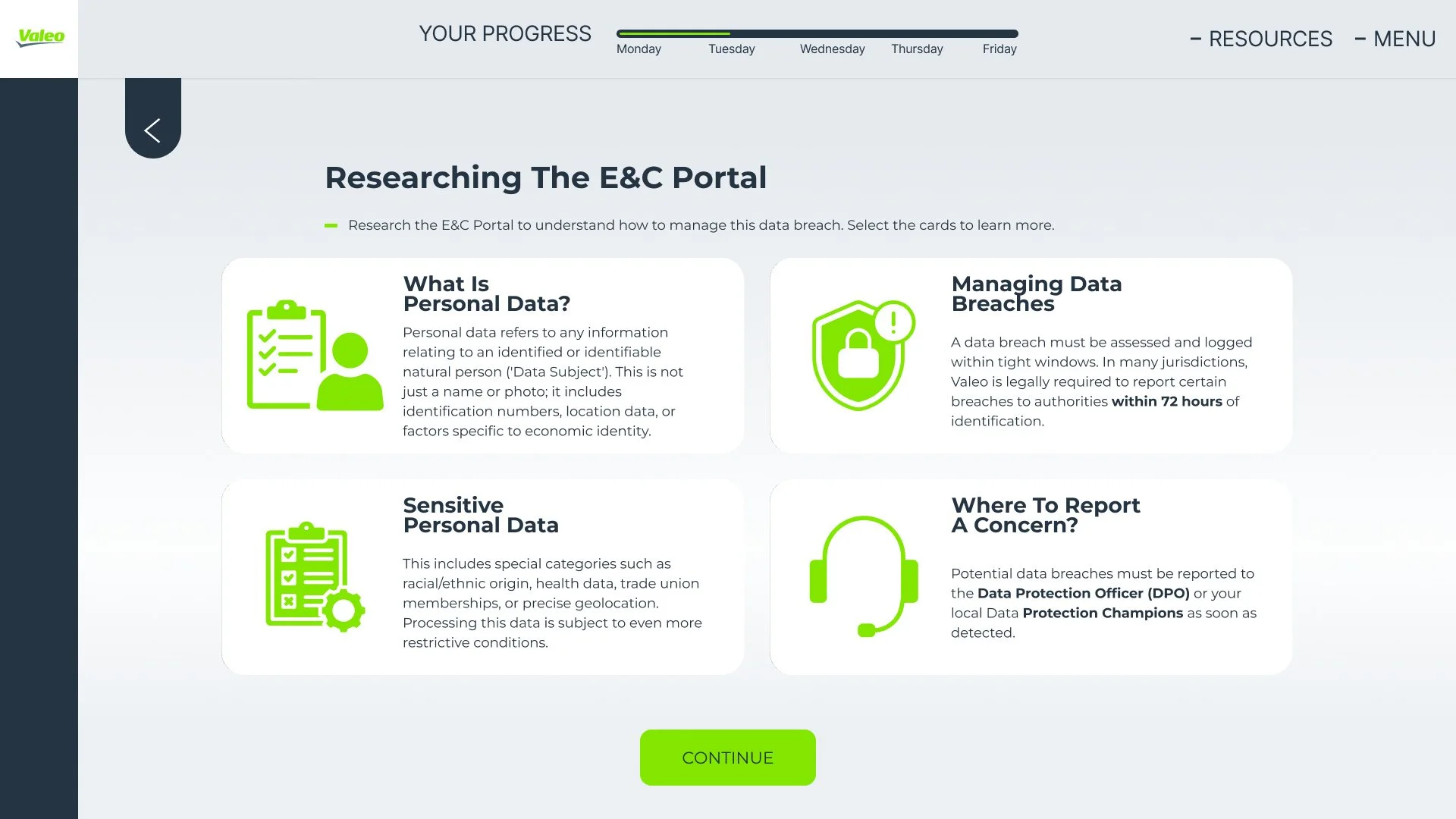
The E&C portal screens break the supporting guidance into topics. Learners can open an accordion or switch between cards to explore the relevant rules before applying them.
Make a choice. Understand the consequence.
Choices sit beside their feedback, so the learner can connect an answer with its explanation. Both correct and incorrect states explain the reasoning, rather than stopping at a score.
See an incorrect answer state

One structure.
Different dilemmas.
The week covers export controls, competition, supply-chain responsibility, anti-bribery and personal data. I used a recurring rhythm of story, exploration and decision to keep the experience familiar as the subject changes.
Clear cues throughout.
A consistent frame
Progress, Resources and Menu stay in the header. A visible back action and recurring Continue button make the next step easy to recognise.
Room for the content
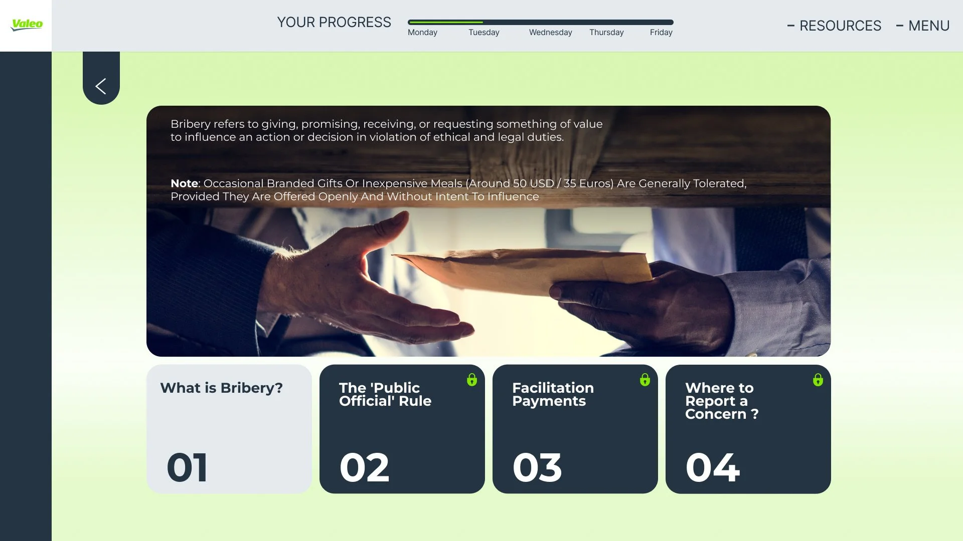
Dark panels give text a defined space over photography. Valeo green highlights actions and selected states, with written labels to explain the feedback.
For me, the key was keeping the interface predictable while the situations changed. The learner should be thinking about the decision in front of them, with the design helping them find the information they need.