
Riders Up
I designed the UX/UI for Riders Up, a horse racing game for Kentucky Derby Museum.
The player journey
From the first screen to the finish.
- 01 / Player step
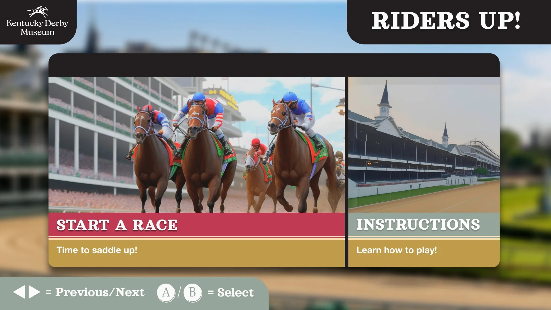
Start
Find the way into the game. Choose Start a Race or open Instructions.
Explore this stage ↓ 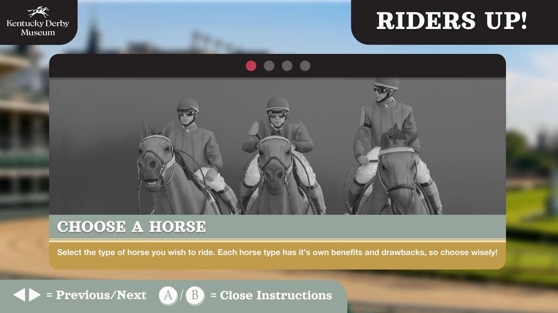 02 / Player step
Learn the essentials
Optional instructions explain horse choice, the course, steering and boost.
Explore this stage ↓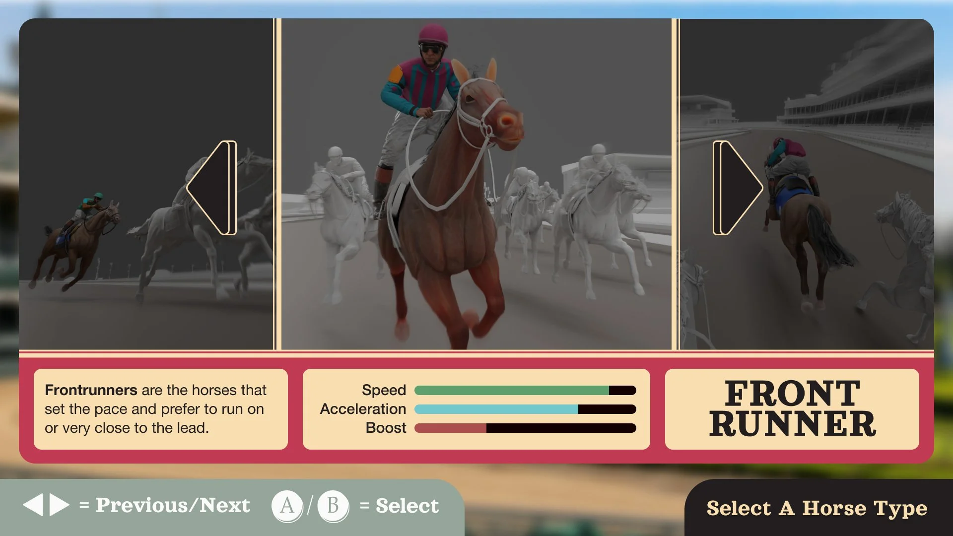 03 / Player step
Choose a horse
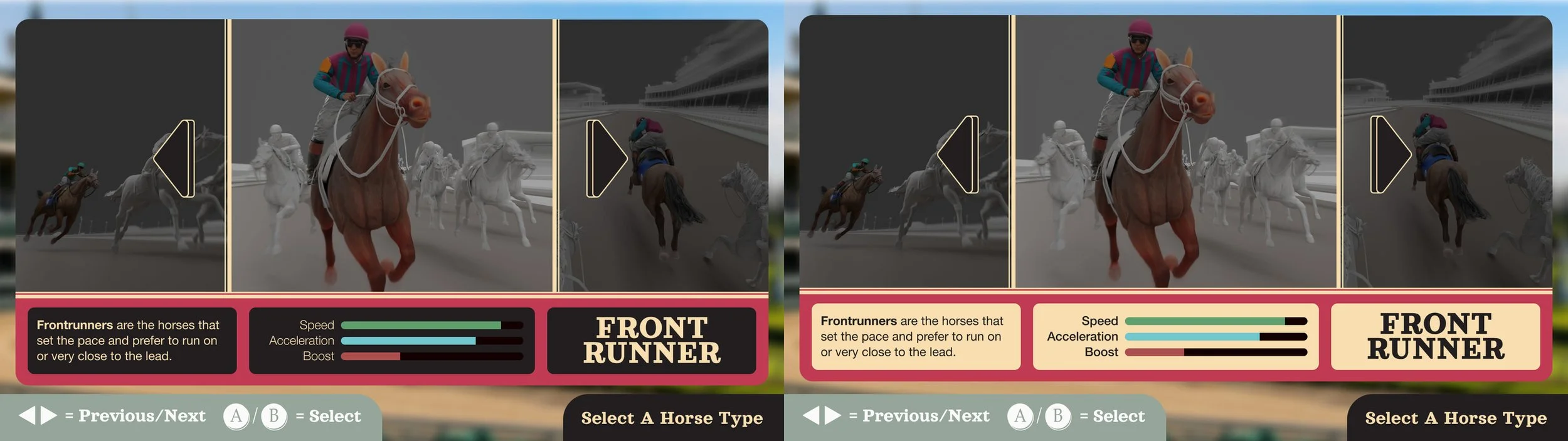
Compare three racing styles and their speed, acceleration and boost.
Explore this stage ↓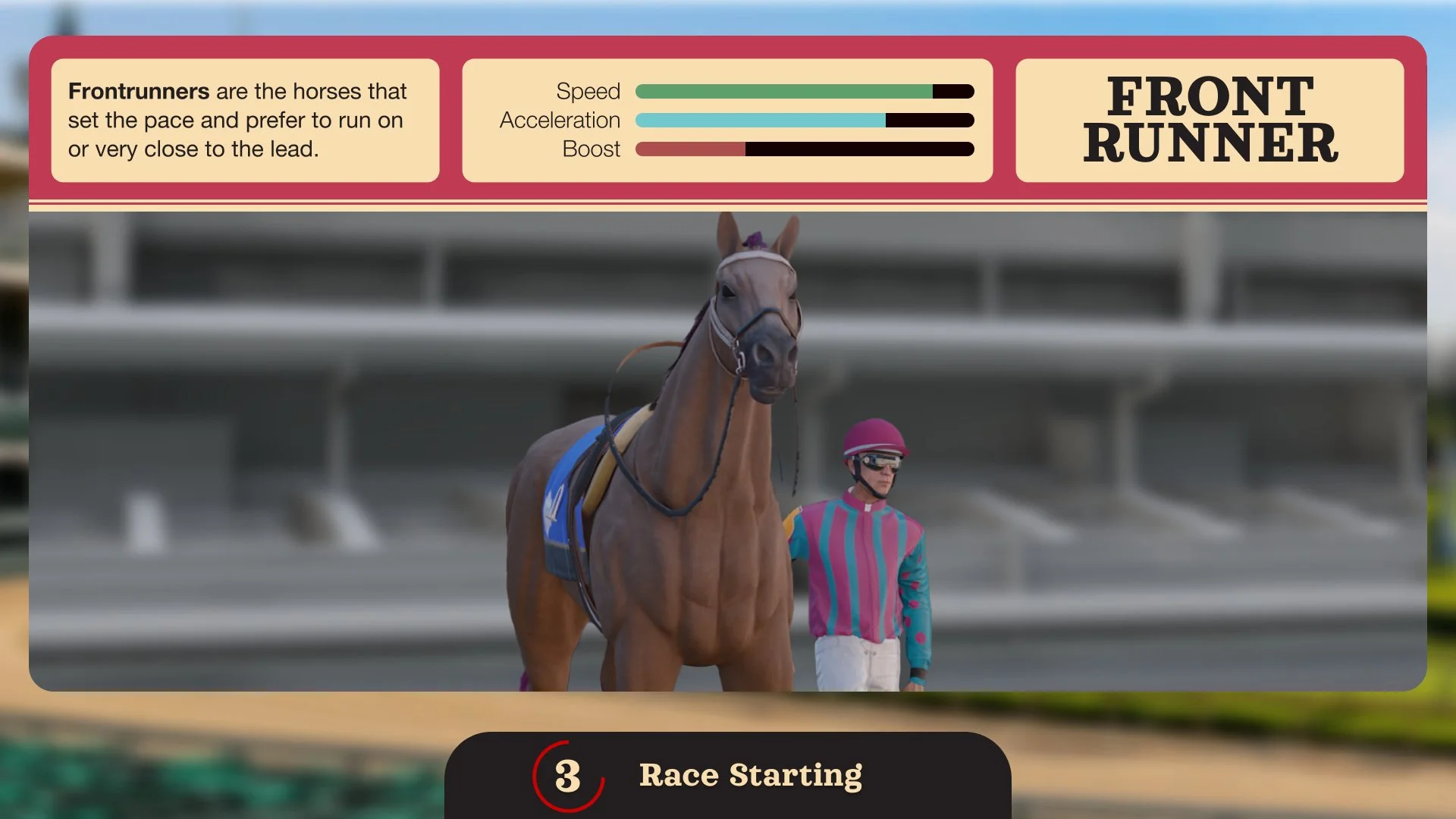 04 / Player step
Get race-ready
Preview the horse and jockey; use loading tips and the countdown to prepare.
Explore this stage ↓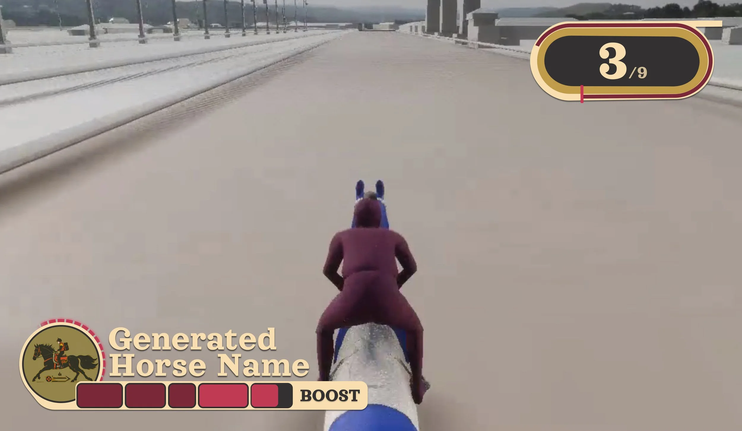 05 / Player step
Race and manage boost
Steer on the track while checking position and boost state.
Explore this stage ↓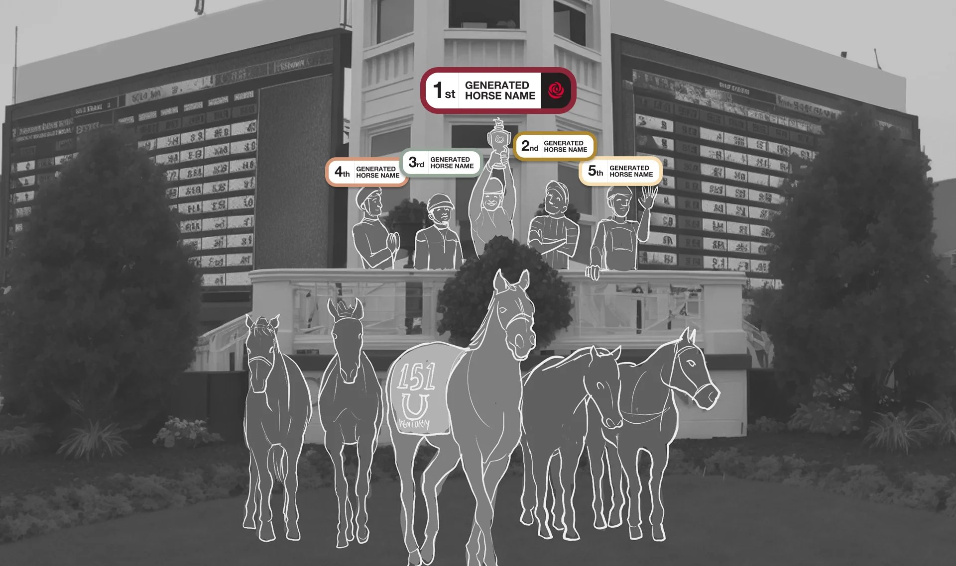 06 / Player step
See the result
Recognise the winner and read the finishing positions.
Explore this stage ↓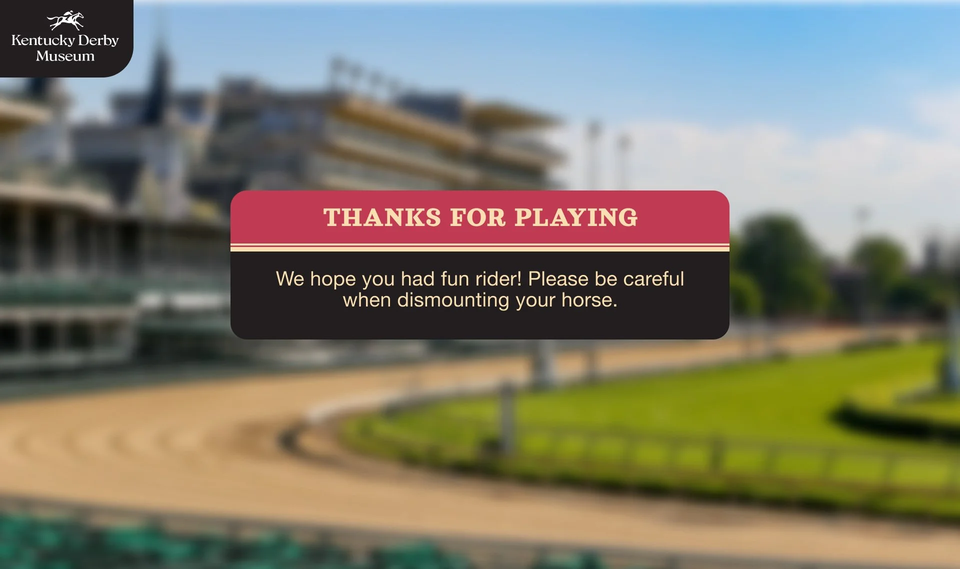 07 / Player step
Finish the visit
Receive a thank-you and a clear reminder to dismount carefully.
Explore this stage ↓
Design explorations from the Figma Review board, including alternative treatments.
Bringing the Derby to the museum
I designed the UX/UI for Riders Up, a horse racing game for Kentucky Derby Museum, through Created By Catalyst.
My focus was the full player journey: getting started, choosing a horse, racing and seeing the result. I wanted the screens to feel part of the game and be easy to follow on a first visit.
Trying, reviewing, refining
I worked through the interface in Figma, reviewing the screens together and trying different treatments.
I compared colour, contrast and layout across the menus, then looked at how the UI sat over the race. The examples below show some of those explorations.
Help a first-time player get started
I kept the first choice simple: start a race or learn how to play.
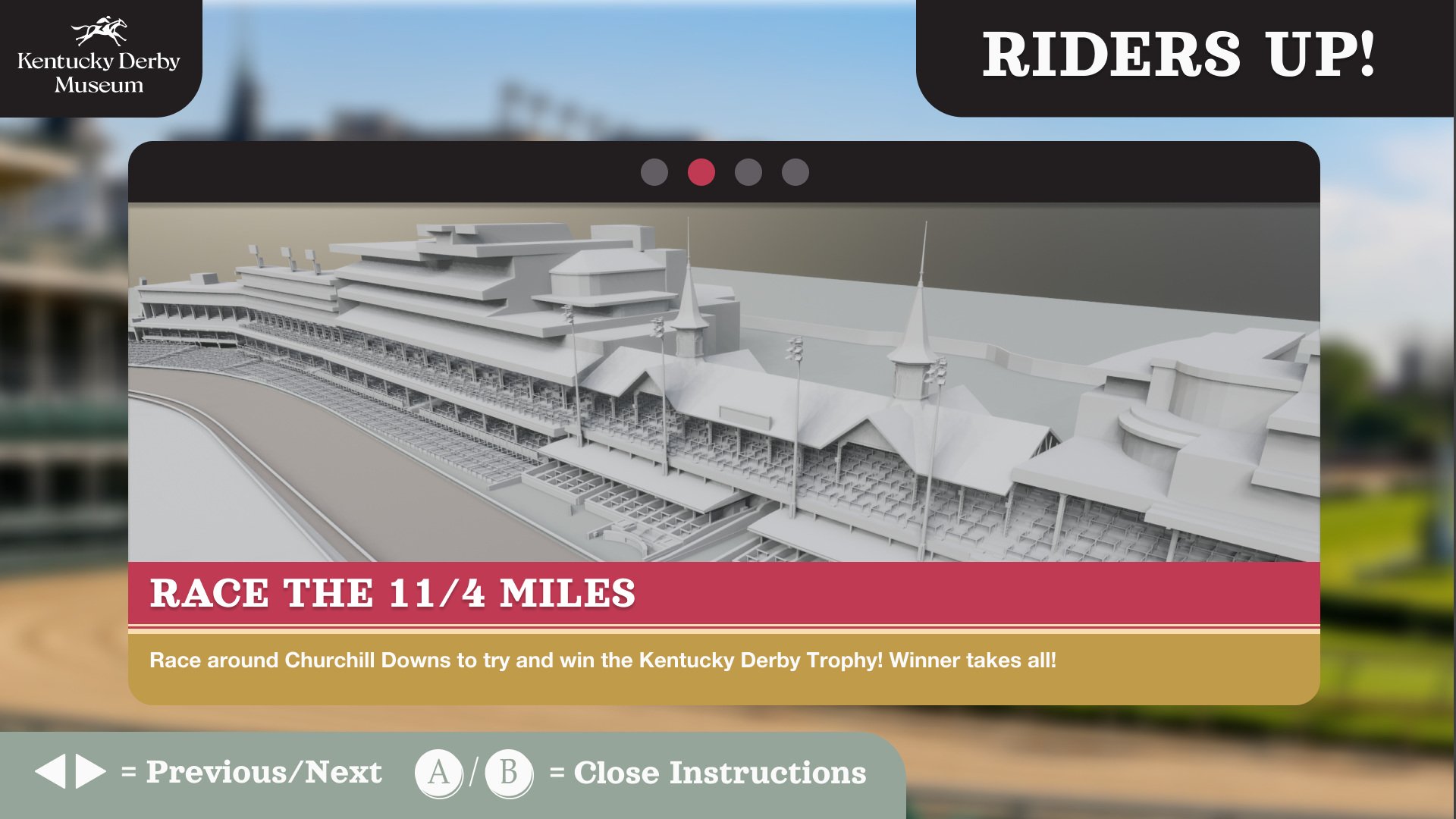
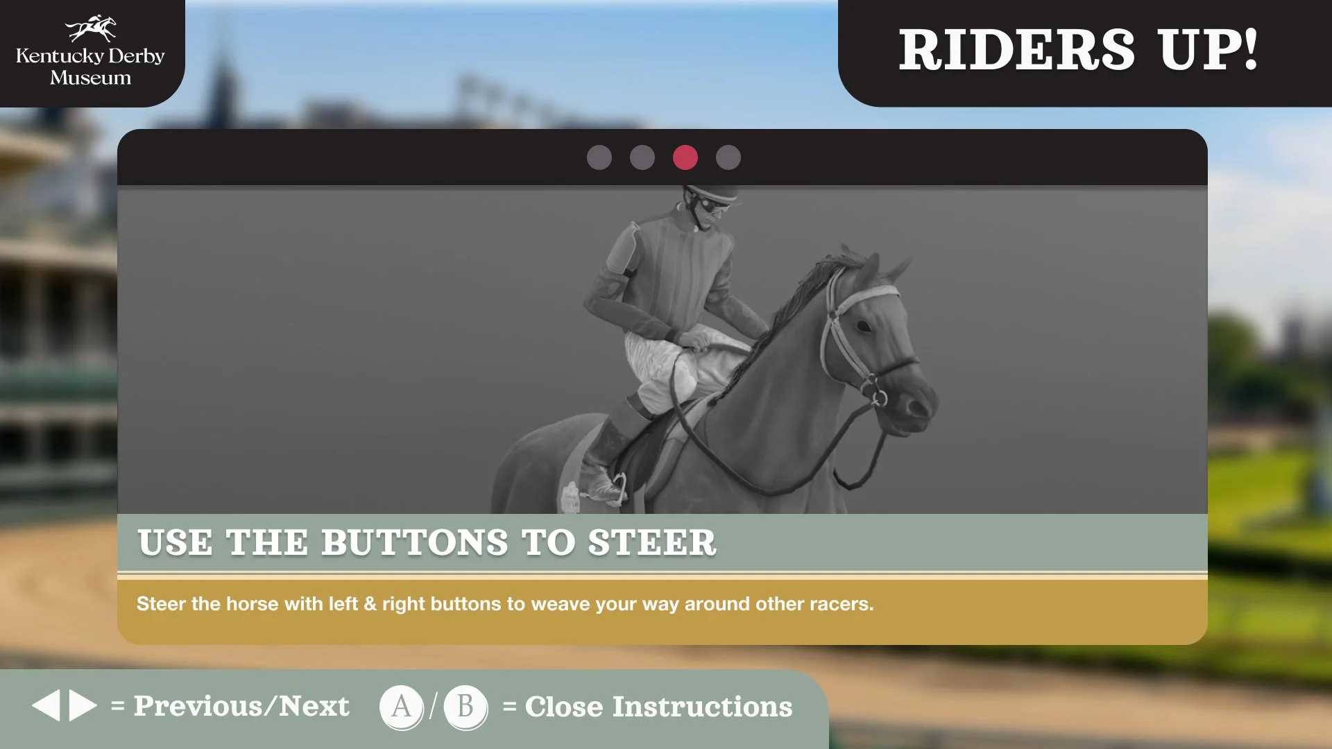
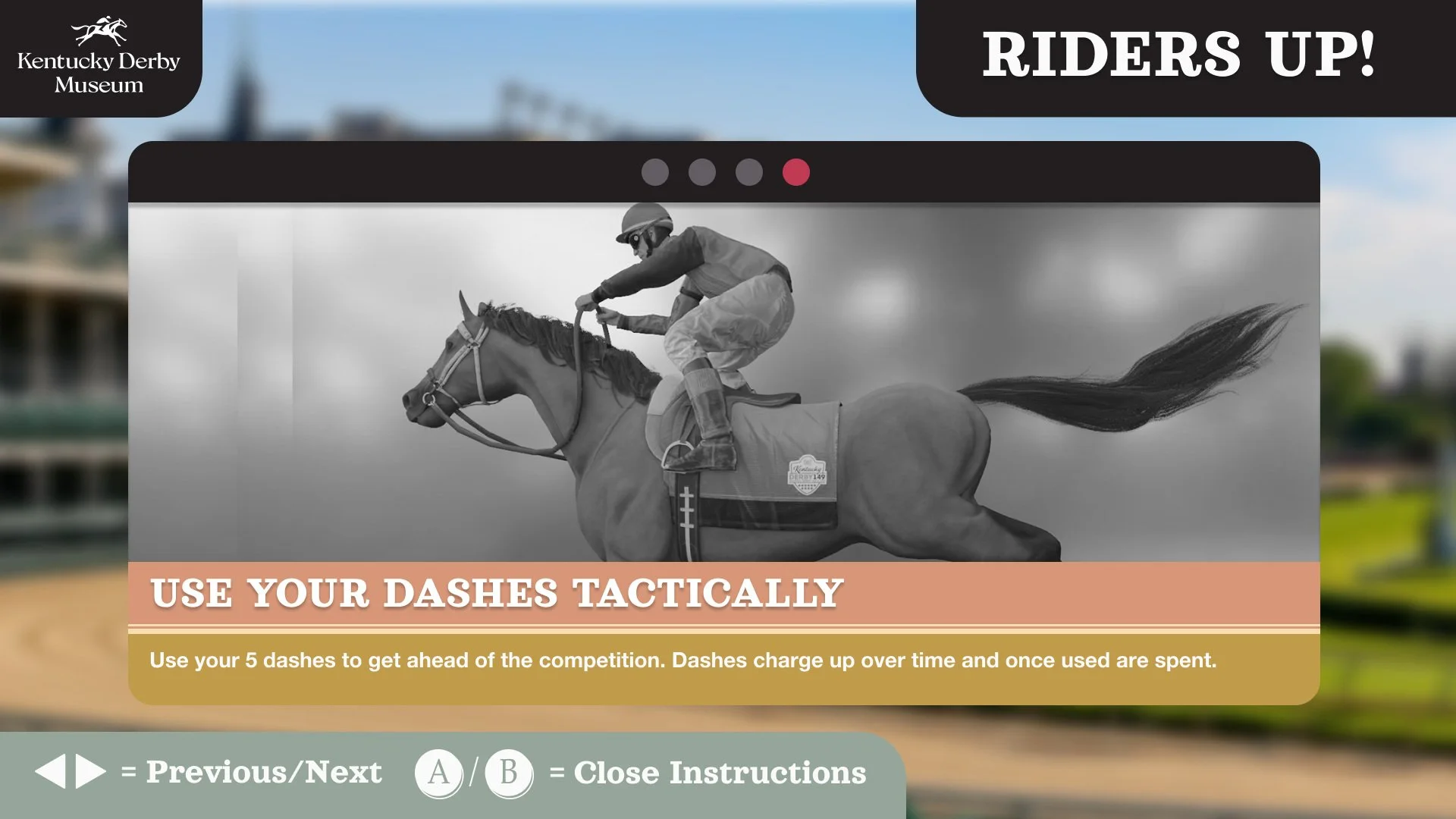
The instructions cover four things: choosing a horse, the course, steering and boost. I kept the controller prompts in the same place so players could focus on what to do next.
Choosing a horse
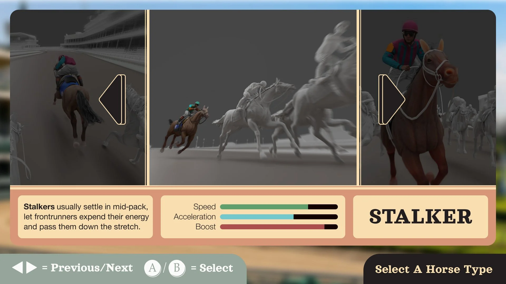
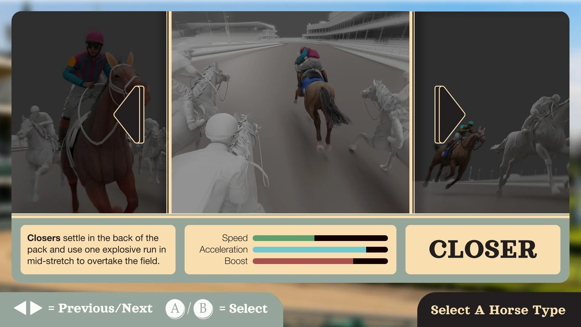
I wanted choosing a horse to feel like part of the game.
Front runner, stalker and closer each have a different racing style. Short descriptions and consistent attribute bars help players compare them without too much reading.
Bridge the choice and the race
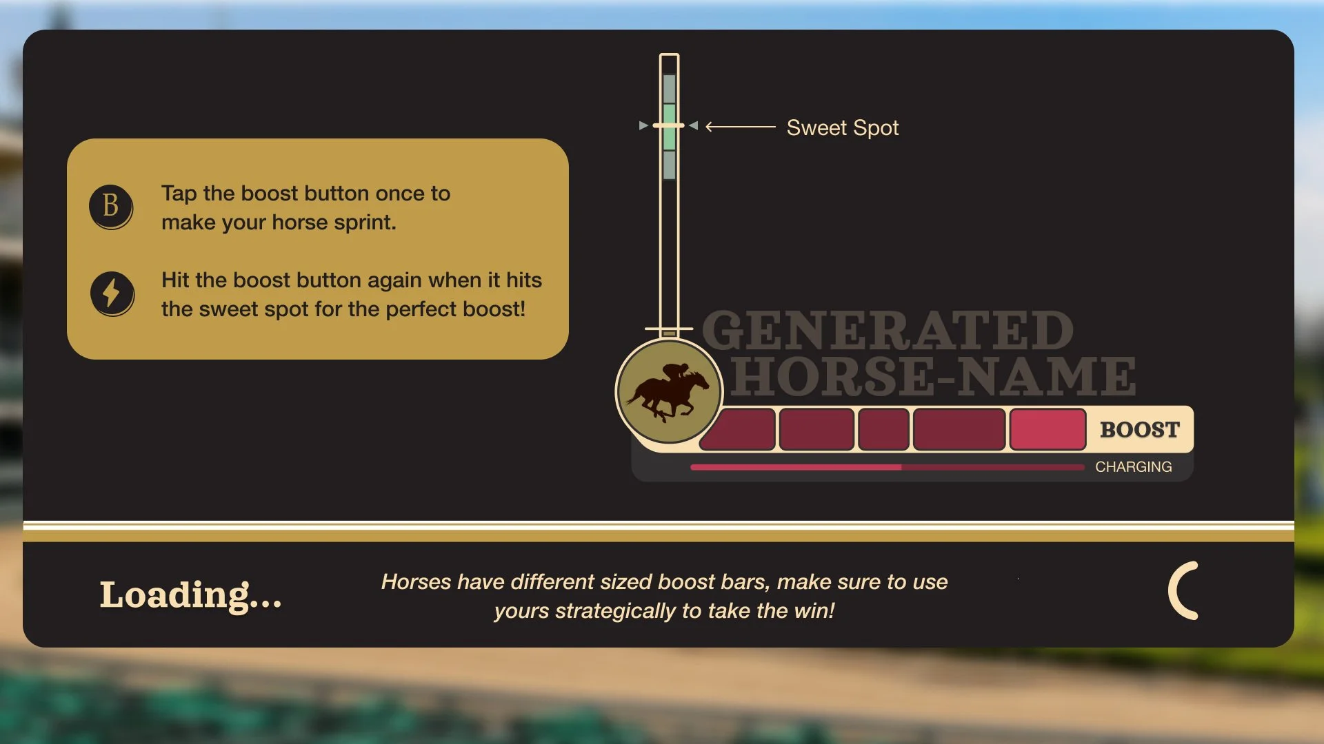
Before the race, players get a look at their horse and jockey, with a countdown to the start.
I used the loading screen to explain boost timing, connecting the tip to the meter players would see during the race.
Keeping the race in focus
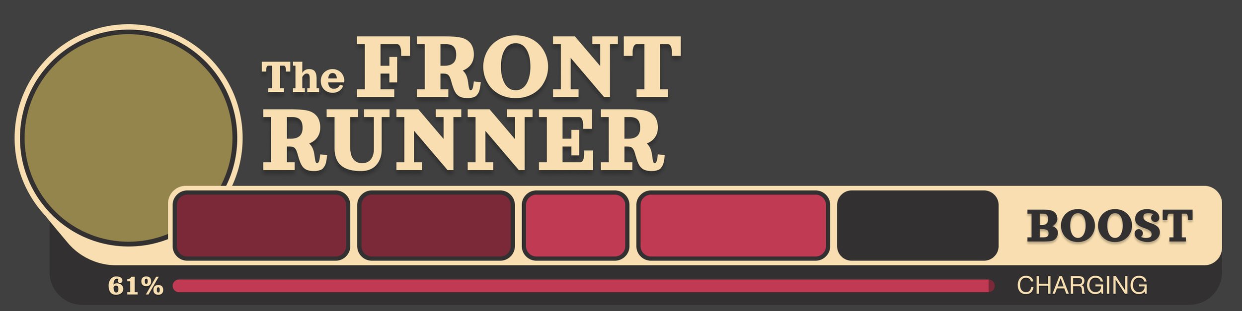
During the race, I kept the centre of the screen clear for the action.
Position sits at the top; horse identity and boost sit below. I wanted players to check how they were doing quickly and get their attention back on the track.
Finding the visual direction
I used bold headings, framed panels and a racing palette to give the menus their character.
The active choice stands out in red. Consistent prompts and short labels keep the screens connected, even as the colours and content change.
Finishing the experience clearly
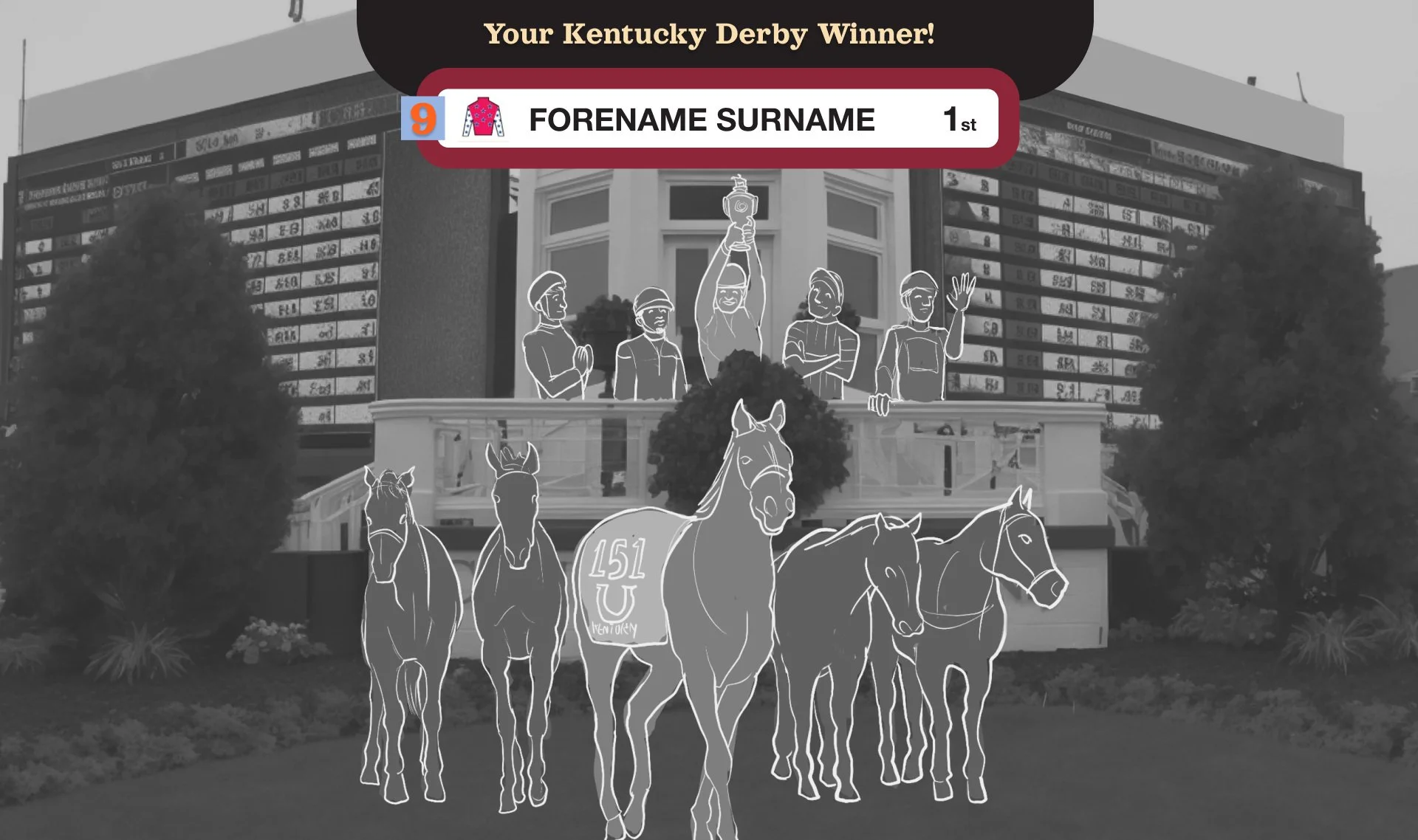
I designed the finish around three moments: celebrate the winner, show the standings and say thanks.
The last screen also reminds players to dismount carefully, bringing them back from the race to the museum.
Riders Up in the museum
This WHAS11 report shows Riders Up in the museum and features Catalyst discussing the project.
What I’d check next
The next thing I’d want to check is how a first-time visitor moves through the game: can they get started, understand their horse choice and read boost while racing?
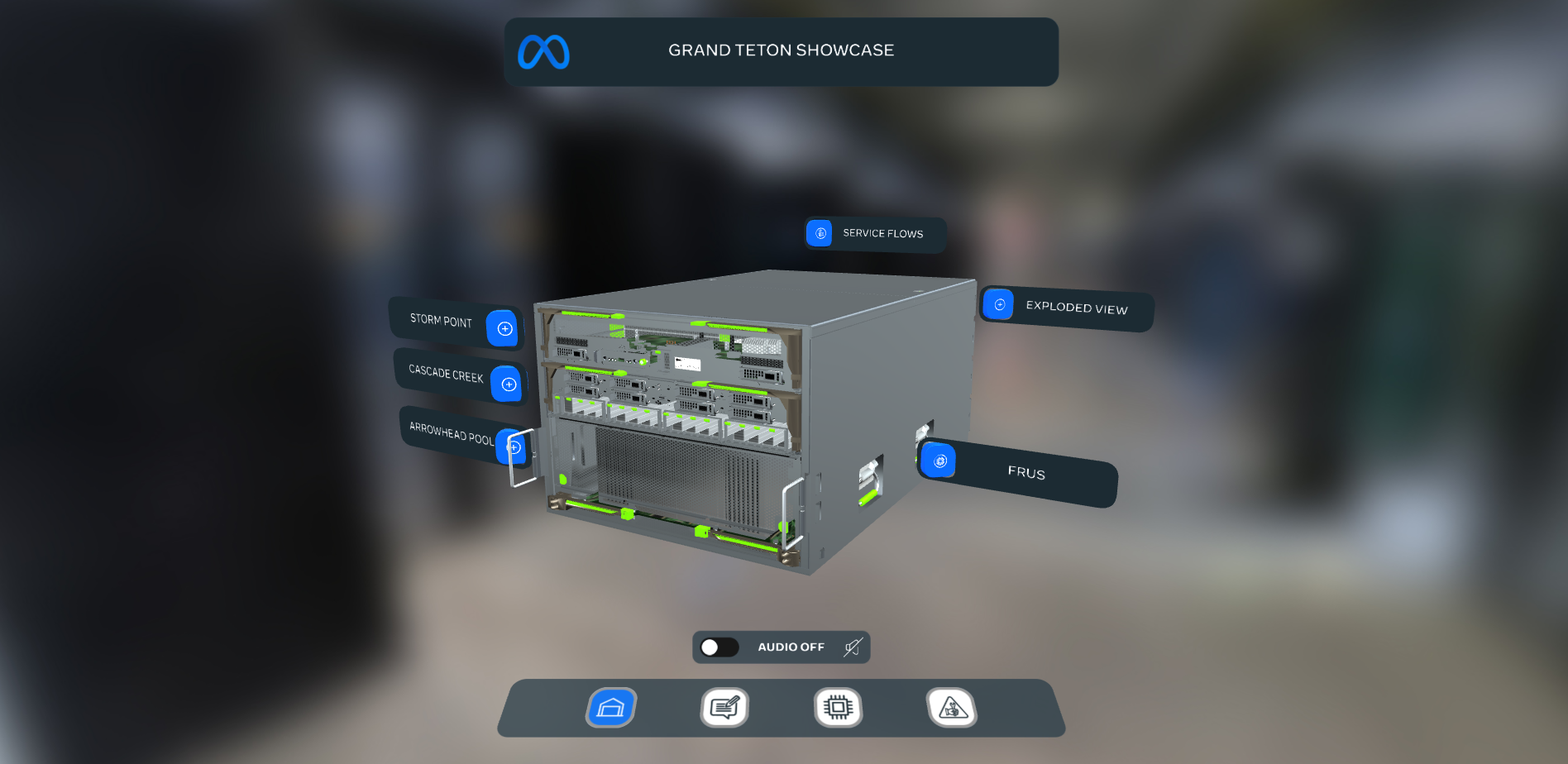
META - Grand teton DC SHOWCASE
Work for Finer Vision
UI/UX & Motion Design
⏲️ Duration
12 weeks
Focus on UI/UX Design
VR Training app
👨💻 Role
UI/UX Design
Motion Designer
📝 Methods
Usability Testing
Research
UI Design
Motion Design
🧰 Tools
Figma
Illustrator
After Effects
📦 The Product
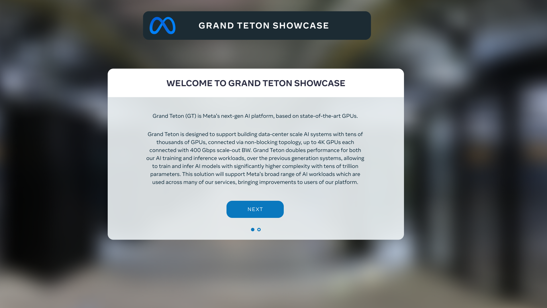
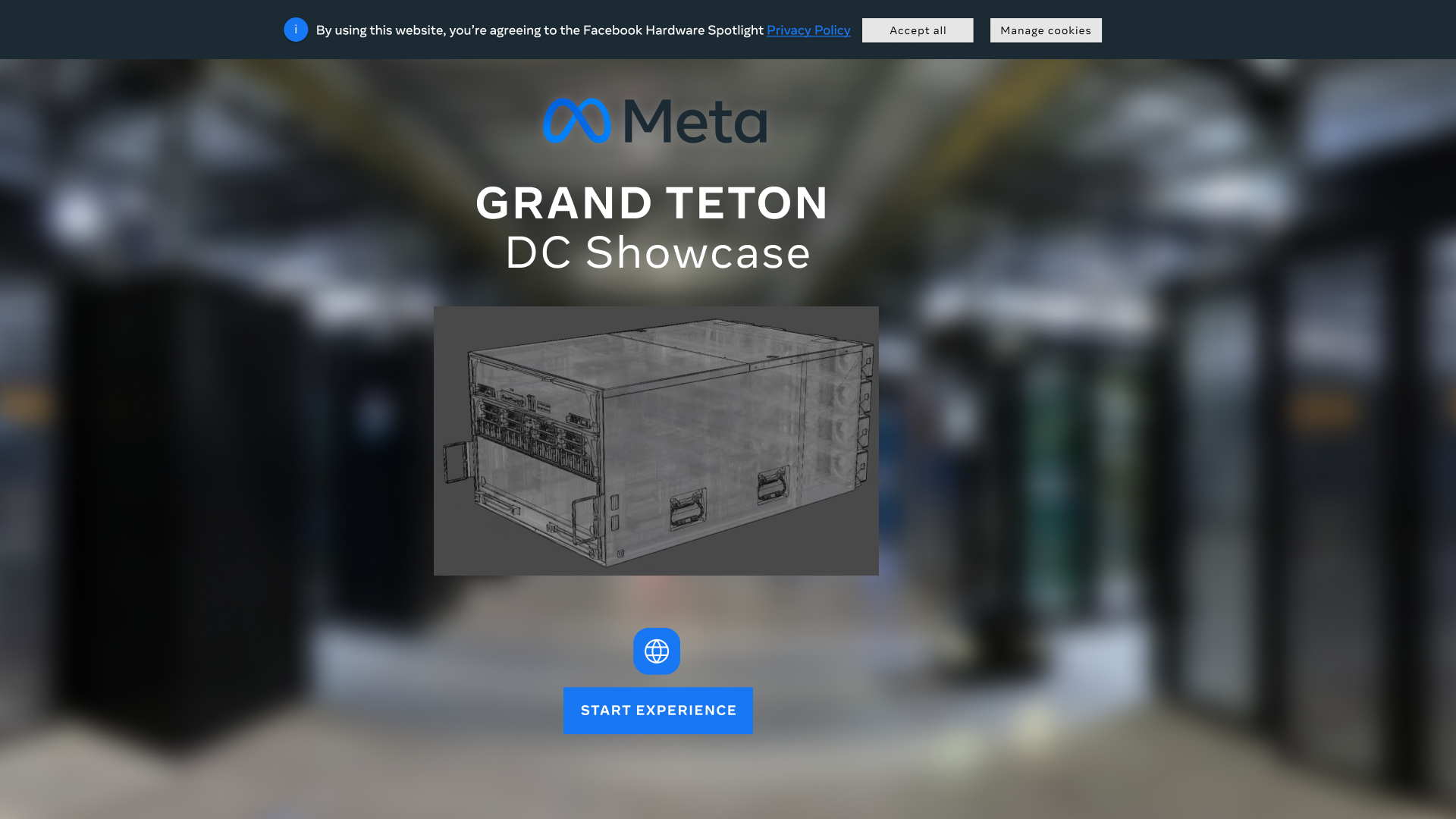
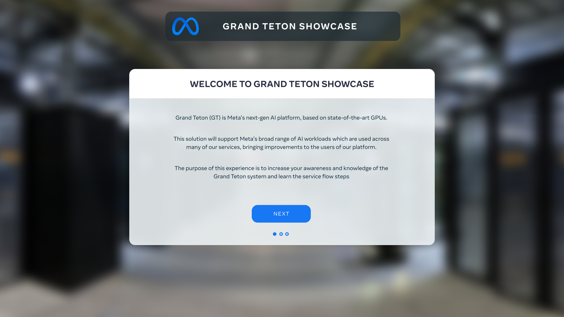
A VR training platform for meta engineers to assist them on malfunctions of the Grand Teton Servers.
🎯 The Goal
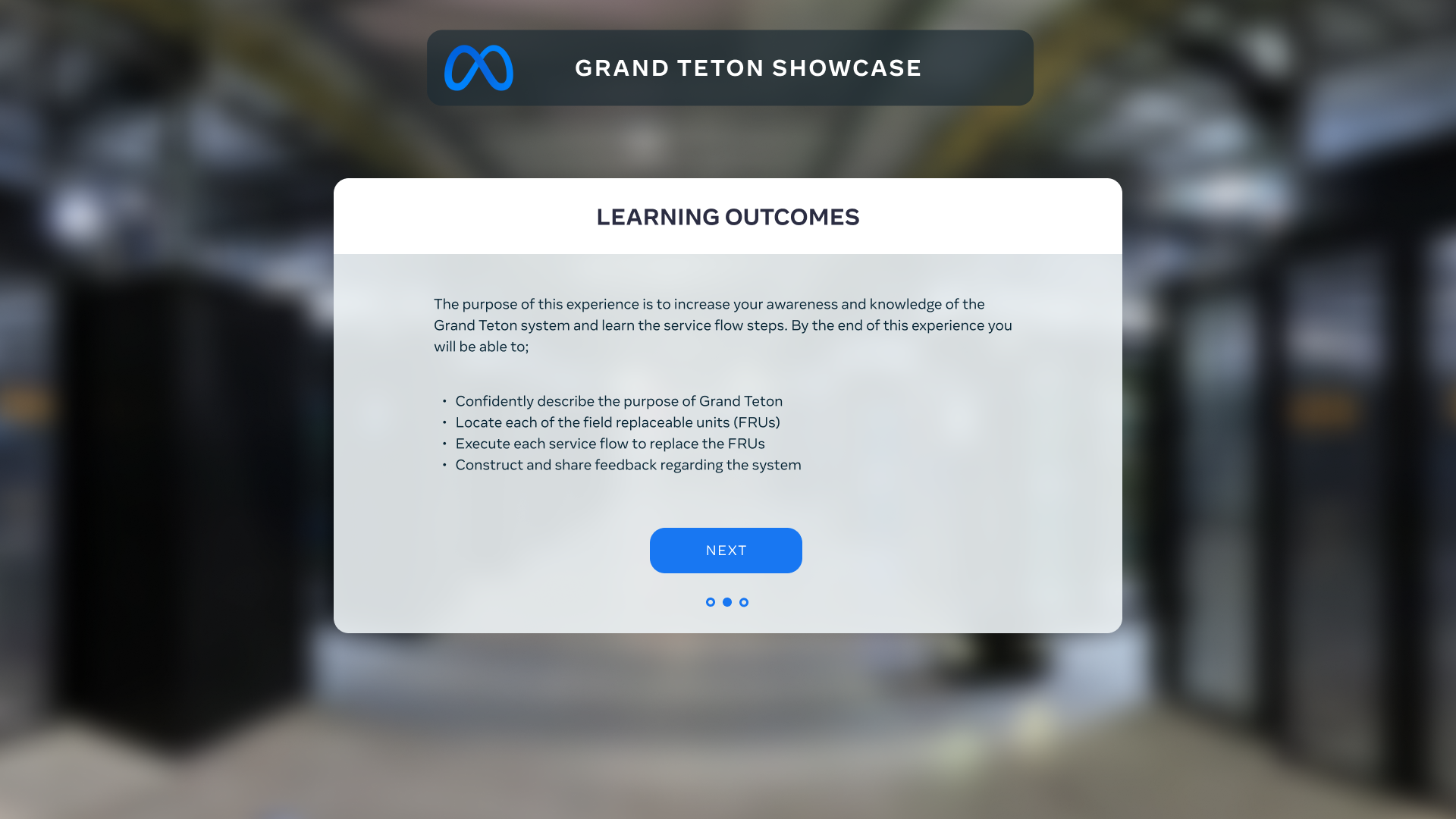
Assist the engineers in training for their new platform and give them a medium where they could have assistance immersively or just on a phone or tablet.
🗠 Method
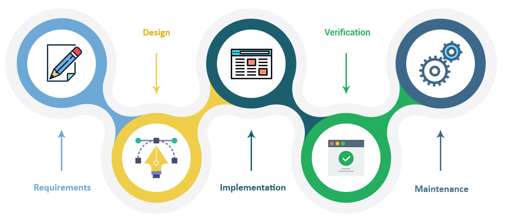
Unfortunately, we couldn't do much user research for this project, so we went with the waterfall model. We started by talking to the client to understand their vision and needs. Then, we came up with ideas in the design phase and got their feedback to decide what to do. After that, we made demos that included UI, motion design, and animations for the VR app.
Once that was done, we carefully checked everything to make sure it matched our design goals. We then worked on the main parts of the app. Moving to the next step, we released a version of the app to the client and their team for testing. This helped us find and fix any issues, making the final product better for the official release to their engineers.
🚩 THE PROBLEM
In terms of user experience (UX), the challenge we faced with this app was creating an immersive and enjoyable training environment it was essential to consider that the users were engineers, and this app would serve as both a tool and a training program.
✏️ IDEATION/UI DESIGN
Since we've teamed up with this client before, we totally got the hang of how they do things in terms of design. This really helped us smooth out how we work on their projects – everything just came together neatly and efficiently. And you know what's cool? We didn't just stick to the usual routine. We mixed in some fresh and creative ideas while keeping that sense of familiarity. The end result? A super cool and engaging user experience that matched up with exactly what our client wanted for their project.
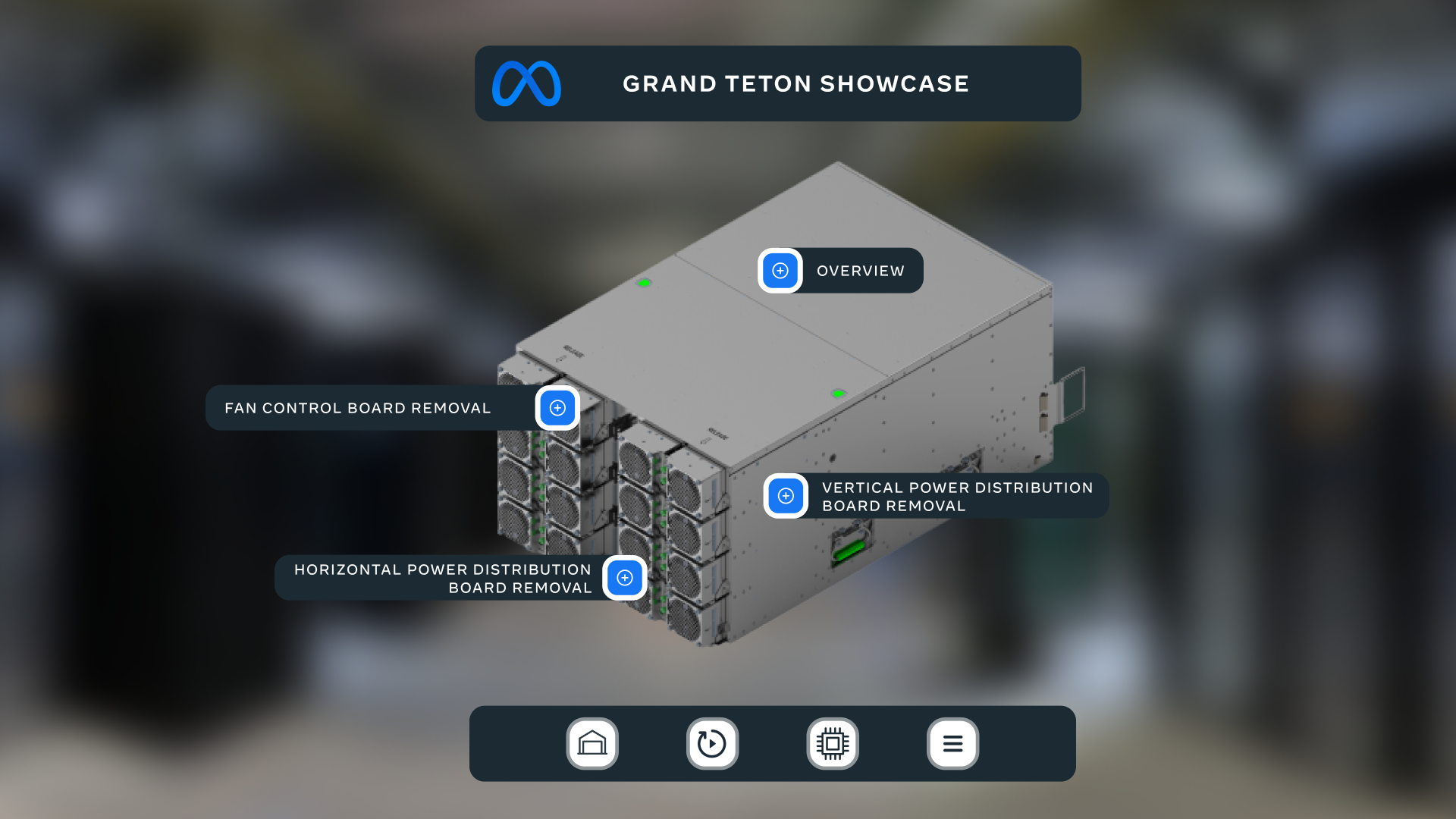
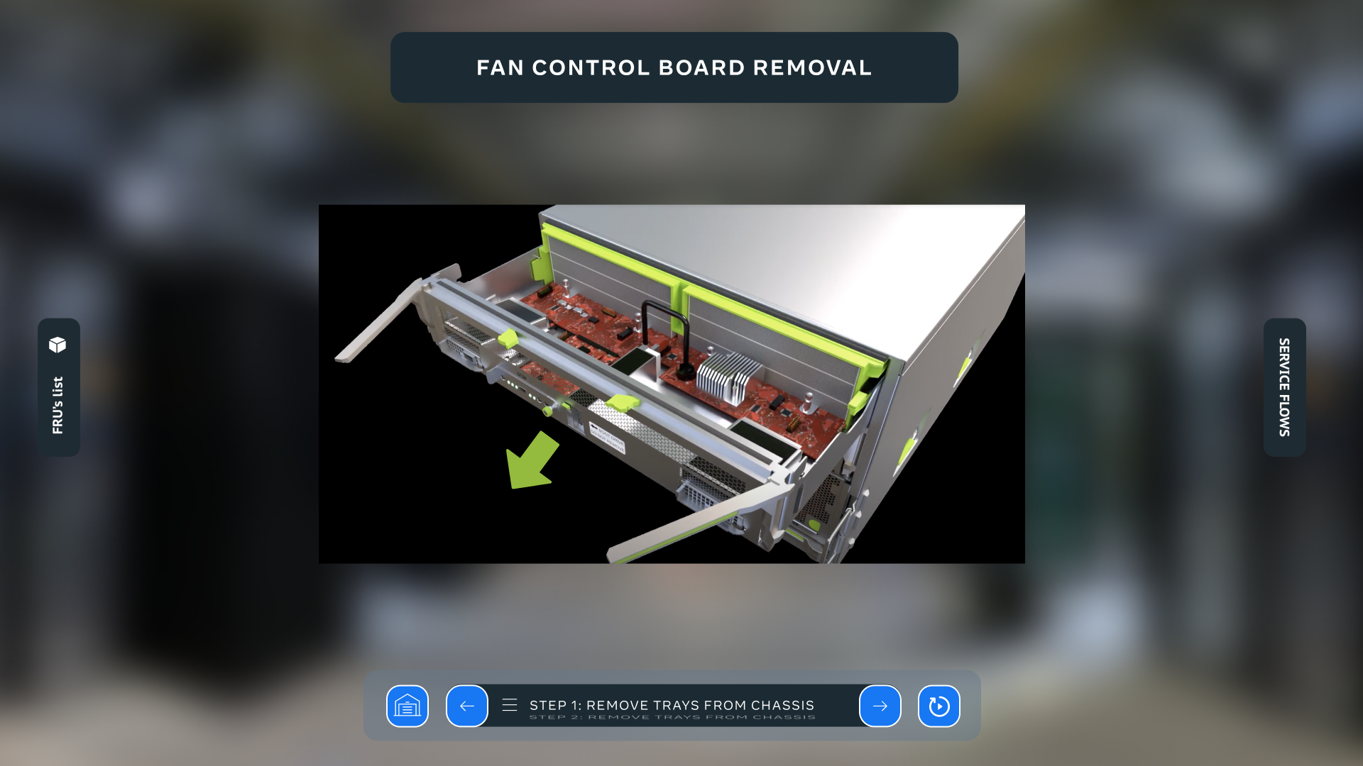
With our client's design system in hand, we dove right into the wireframing process. But we didn't stop at just basic wireframes – we went almost full-on high-fidelity. This meant we cranked up the details to really show how things would look and work. It was like giving the project a sneak peek, showcasing the design system in action and bringing it all to life visually.
As our project journey continued, we shifted gears into crafting captivating 3D instructional videos. This was the playground for our motion design creativity. We didn't just jump in blindly – we kicked things off by storyboarding our ideas. This way, we had a roadmap to follow, ensuring that every twist and turn in the motion design had a purpose and told the story effectively.
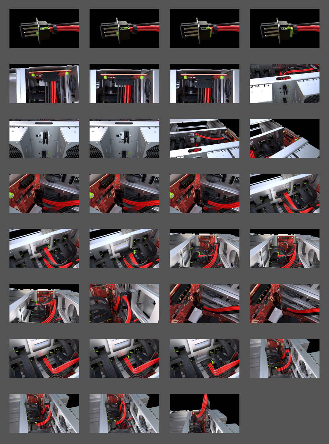
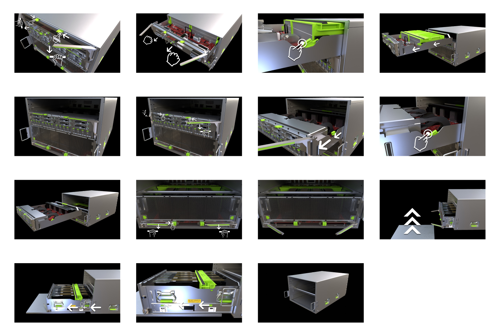
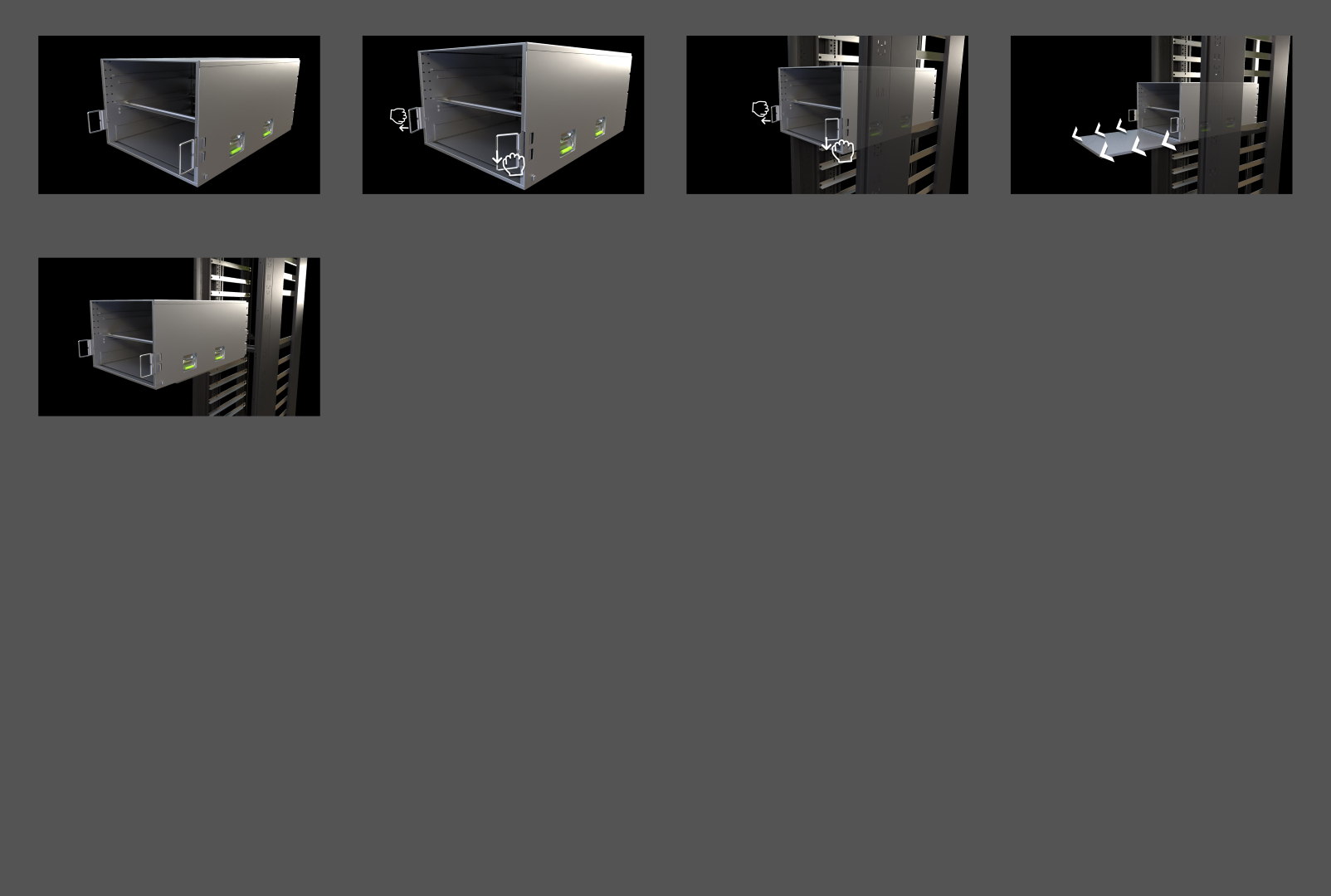
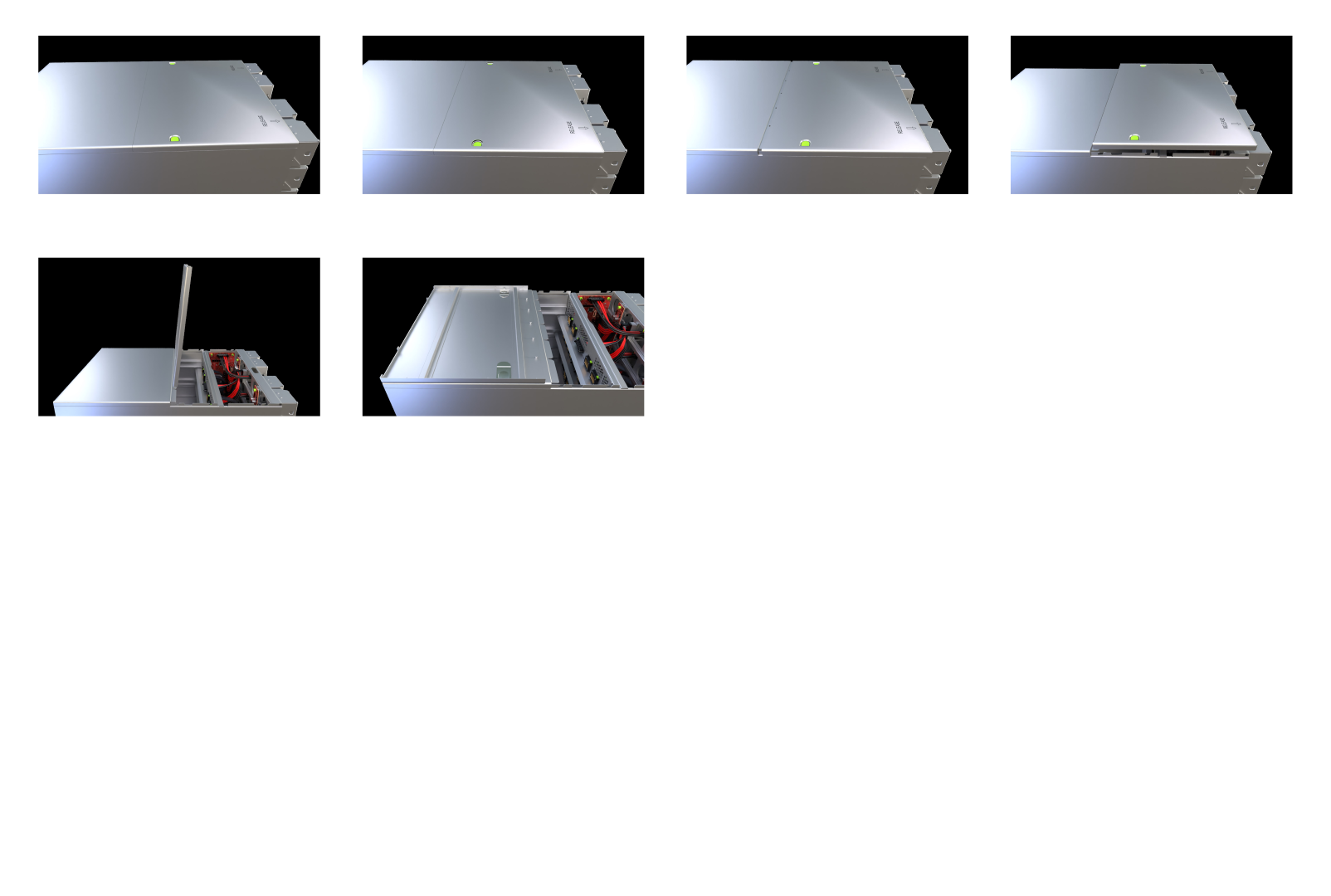
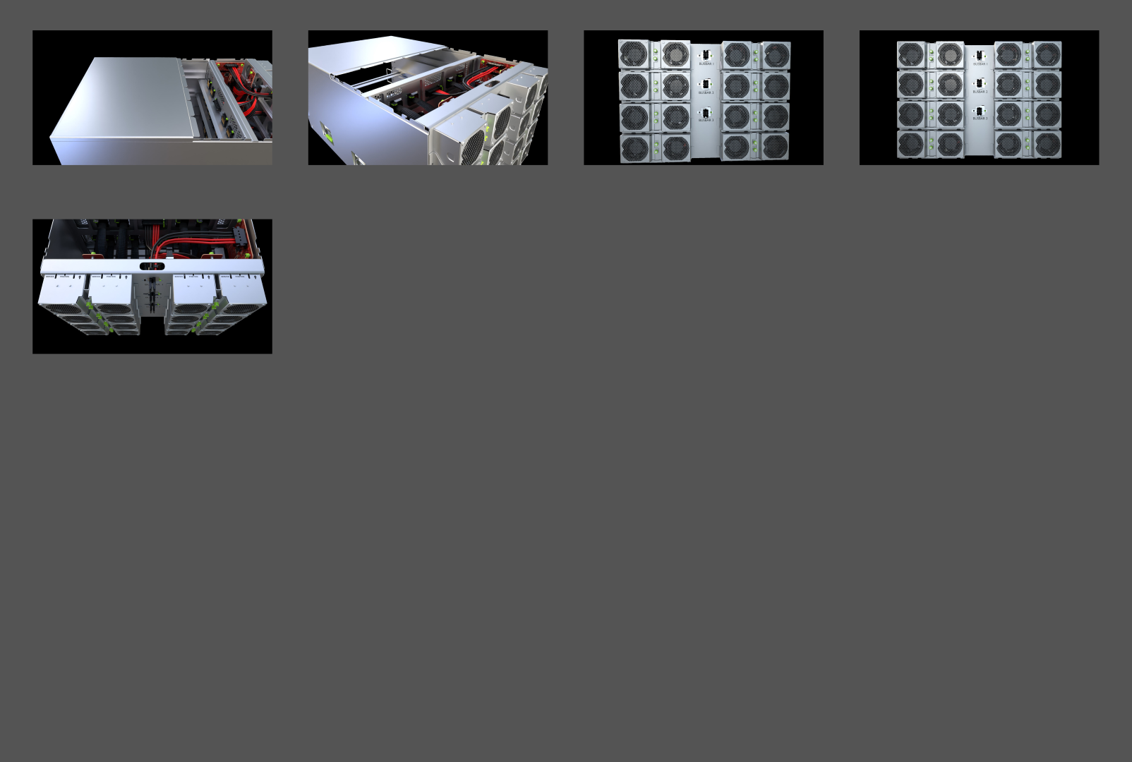
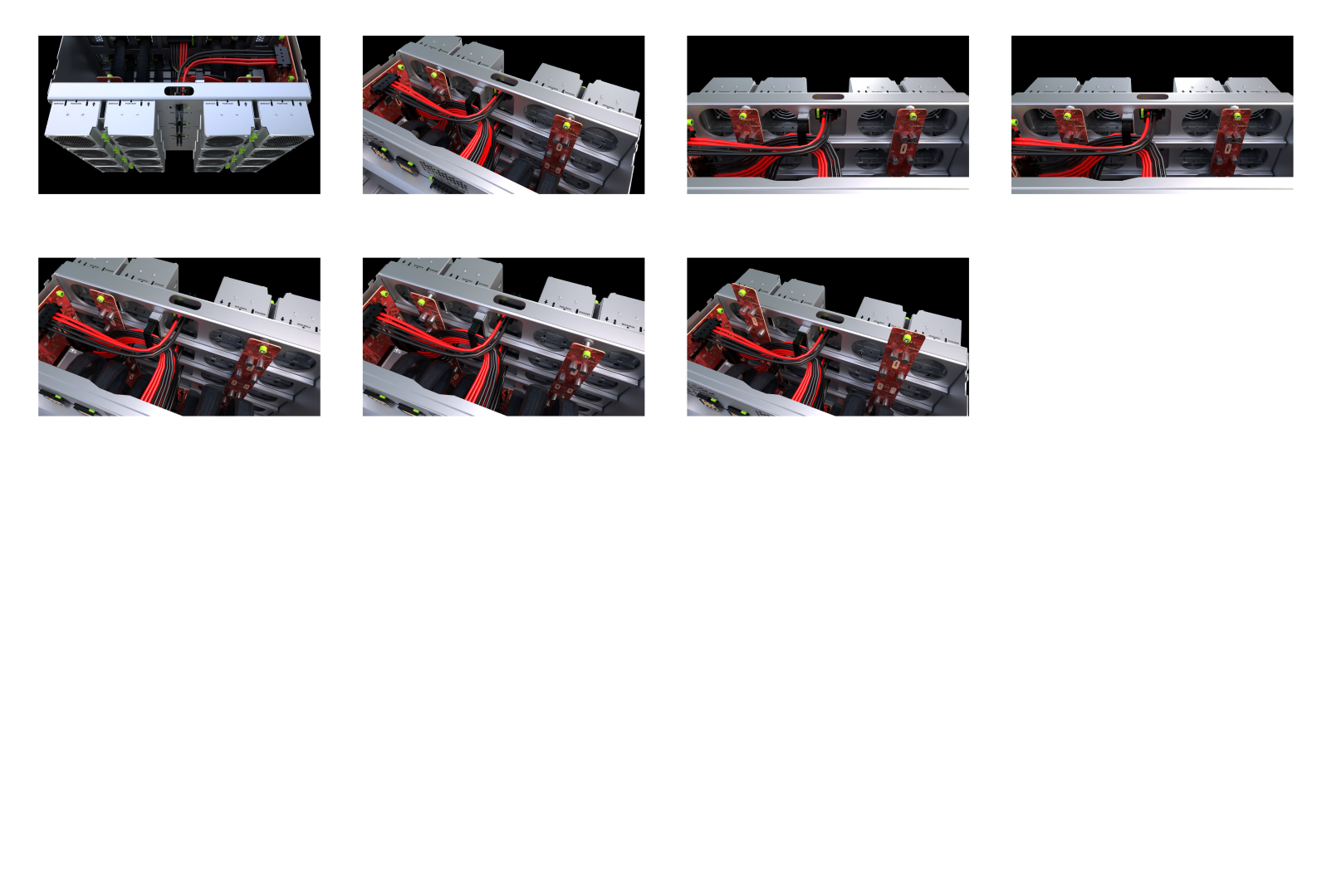
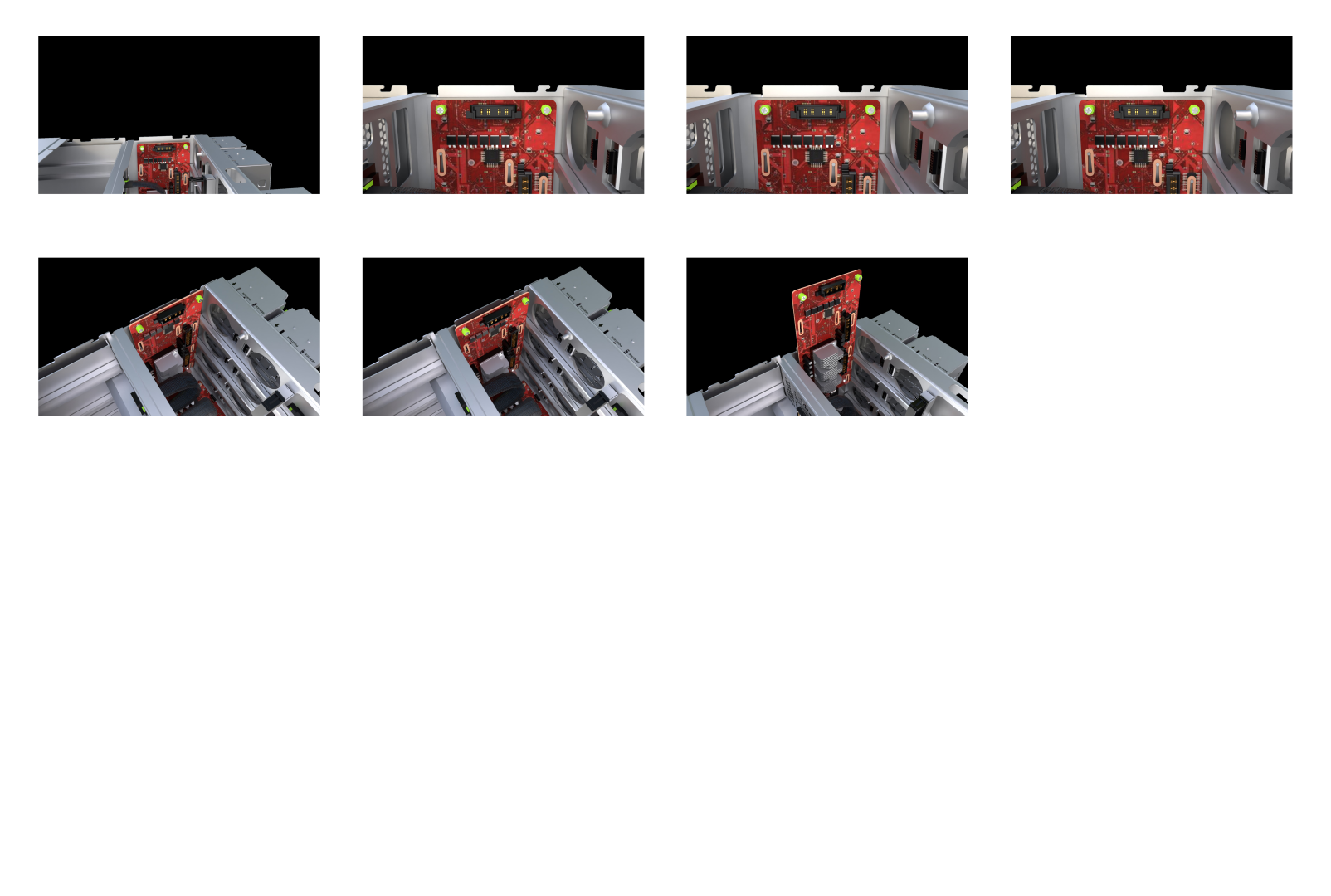
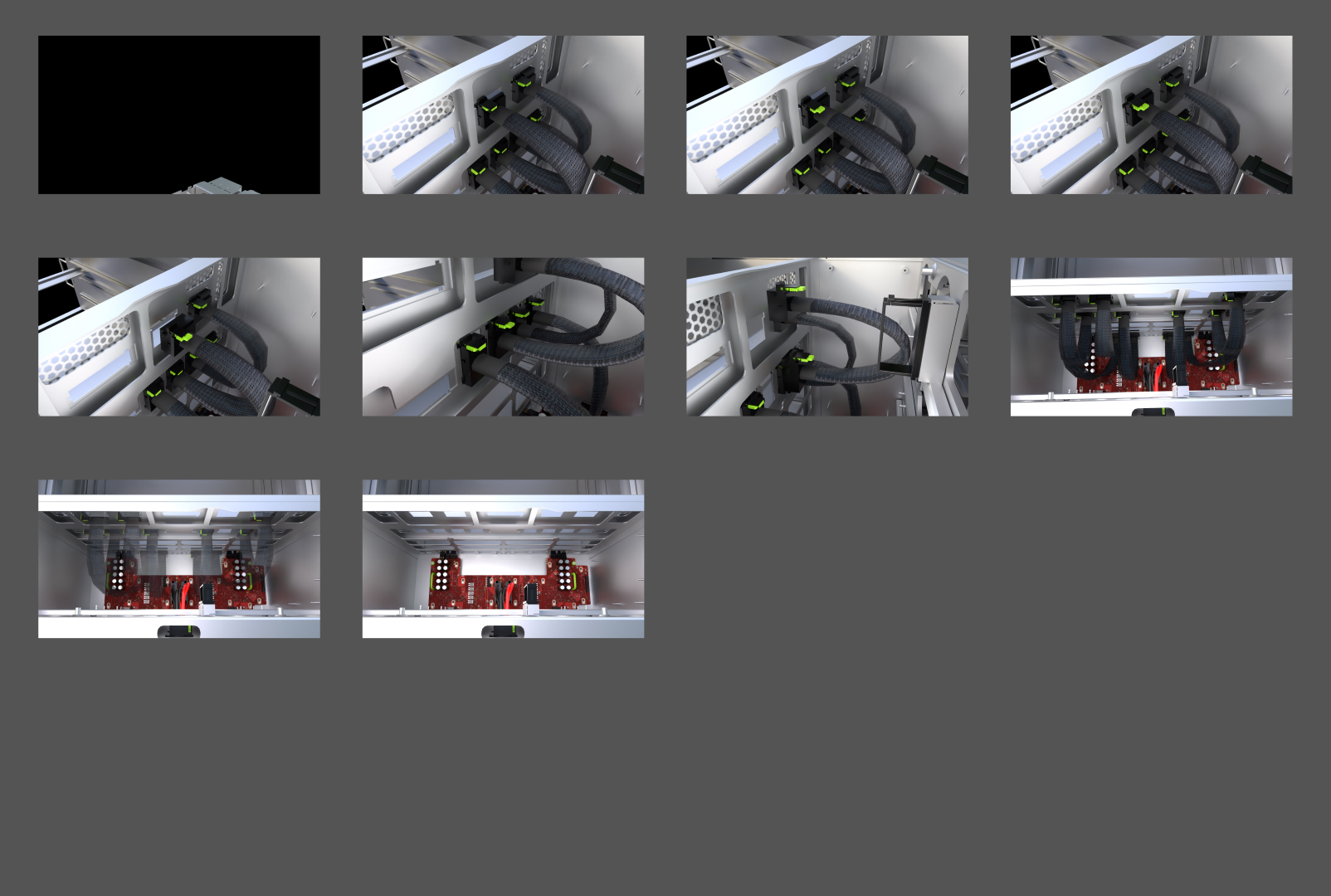
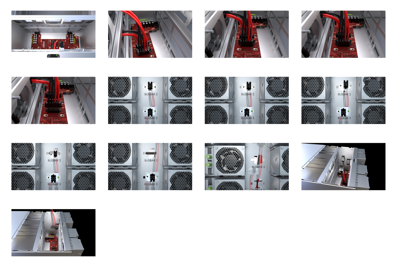
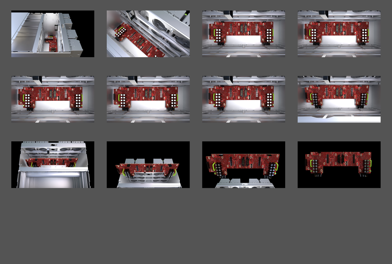
After wrapping up our exciting phase with the 3D instructions, we smoothly transitioned into the next gear.
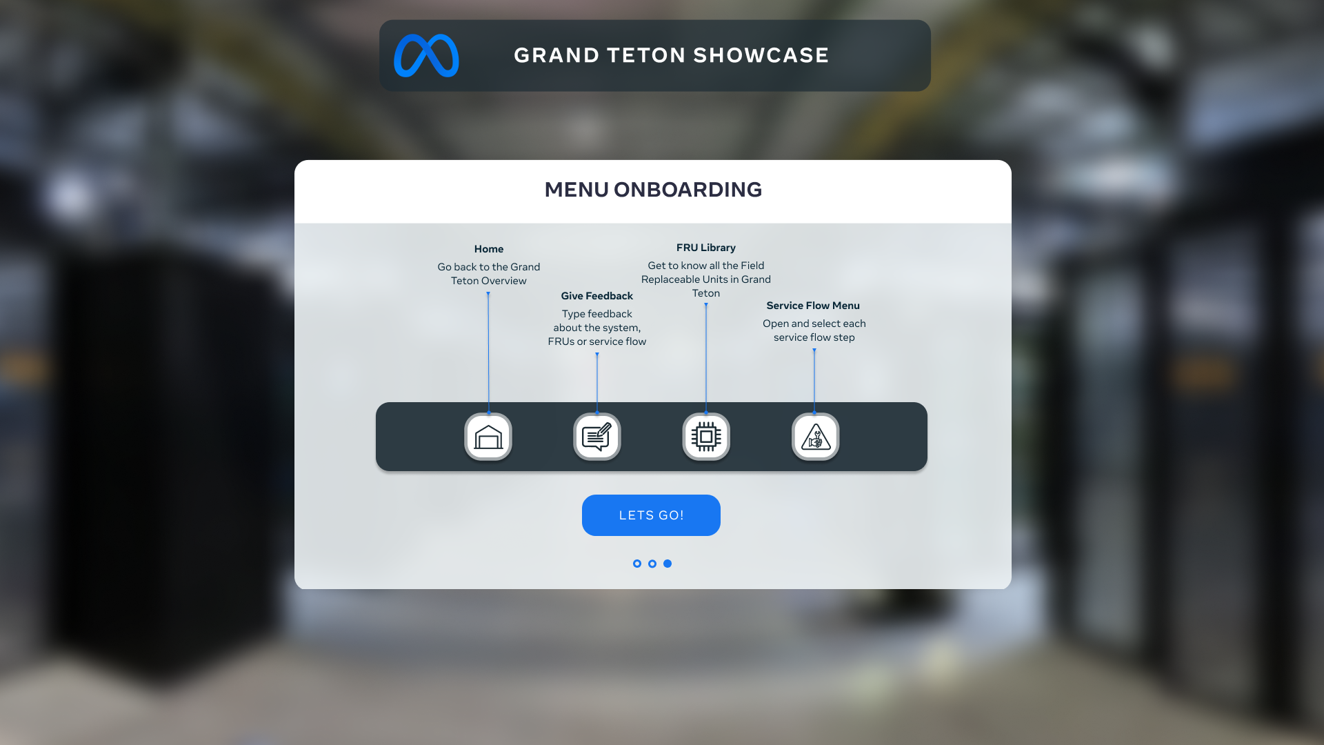
This meant diving headfirst into shaping a rock-solid user experience and a sleek user interface for the entire VR app.
Our goal? To ensure that every tap, swipe, and interaction felt like second nature, guiding users through the
immersive training we've crafted.
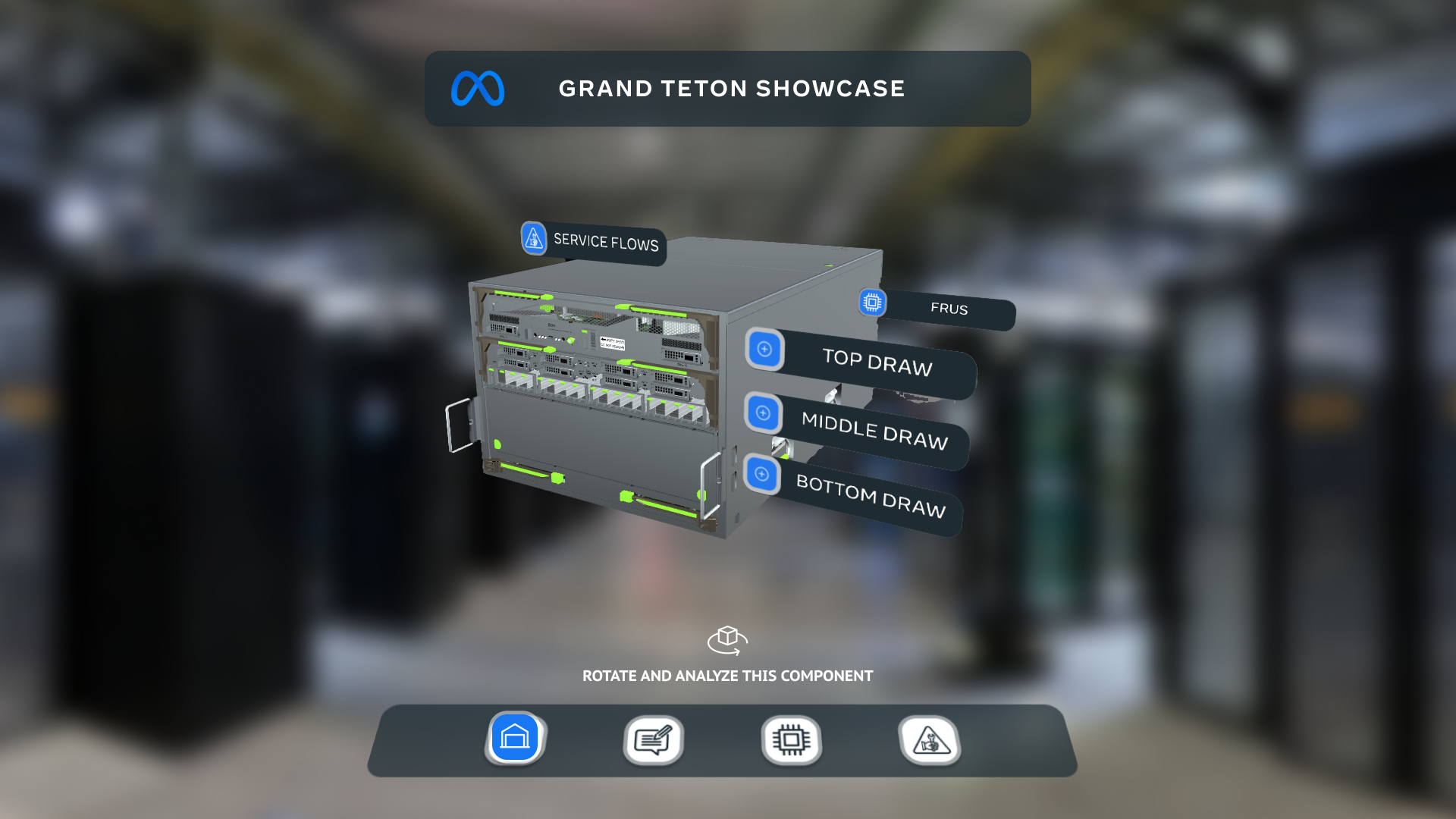
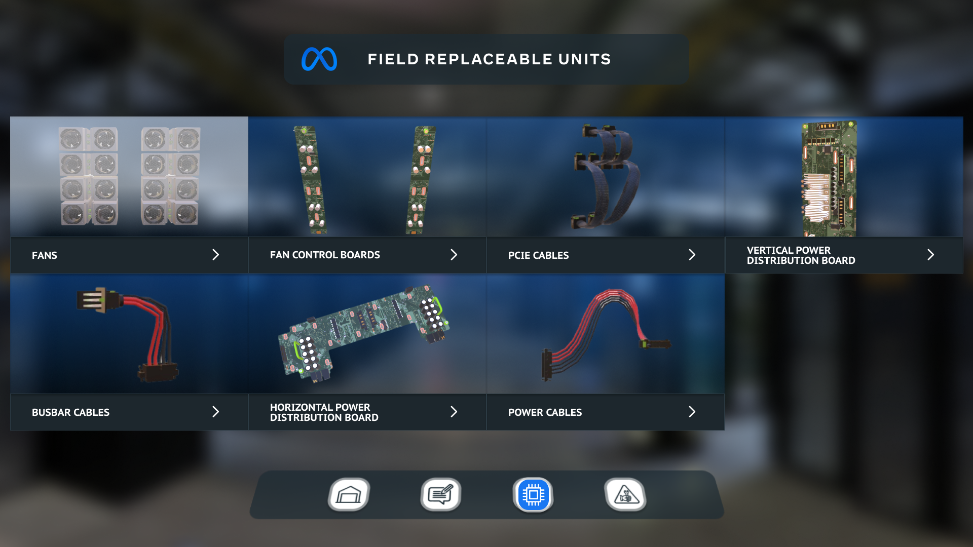
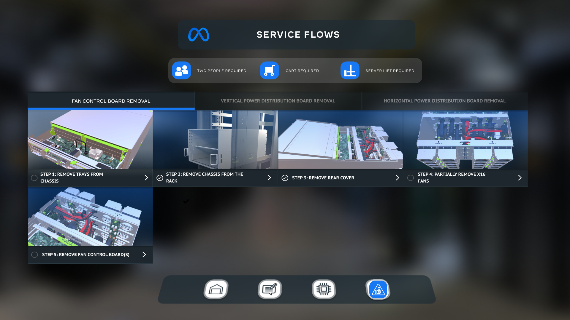
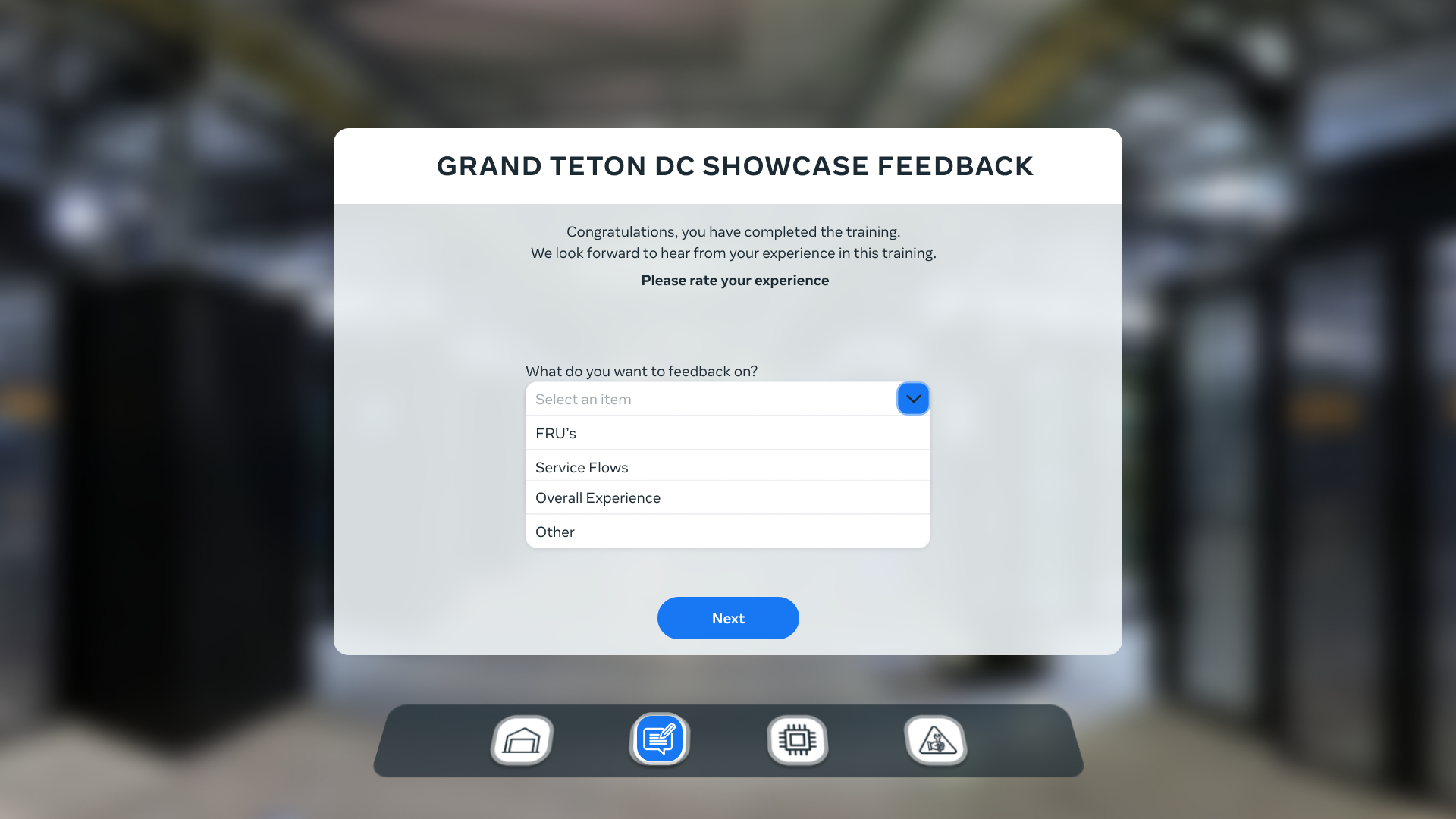
🚀 Deployment
In the grand finale of our project, we pulled off a slick move – we launched a demo version for the client's in-house testing.
This gave them the chance to tinker around and get a feel for things before the official training release.
From there, it was all about squashing those pesky bugs. We fine-tuned the app, ensuring it was in tip-top shape. And guess what?
The app hit the release date right on the money, just as planned. It was a seamless journey from demo to debut!